Case study · Logo, Brand identity
WCFF: A Mobile Game Logo Built for Flag Football’s Big Debut in LA

The Challenge
Flag football will make its Olympic debut at the 2028 Summer Olympics in Los Angeles. WCFF, a mobile video game, was built around that moment, and it needed a logo to match.
The brief came with four requirements.
The logo had to work in black and white, and in reverse, without losing recognition.
It needed a palette inspired by the Olympic combination of yellow, red, blue and green, but more fitting for the video game world.
It needed a custom wordmark for the abbreviation, the kind of unique lettering that big game titles have.
And it had to include flag football itself: the ball and the flag.
Each request made sense on its own. Together, they were a recipe for a crowded logo. My challenge was to fit everything in without it feeling overwhelming.
The Starting Point
The client shared a few game logos as references, which gave me a clear picture of the energy they wanted. Games use bright, saturated colors, so I pushed the four inspiration colors in that direction, making every shade more vibrant than usual.
My first idea was to shape the letters WCFF into a ball. It was tempting: one simple symbol instead of two. But the structure of the letters didn’t cooperate, and the result looked forced. So I separated them: a custom wordmark placed inside a ball icon.
The Idea
Once I stopped forcing everything into one shape, one thought guided the rest of the design:
Flag football is a team game that never stands still, so the logo shouldn’t either.
Logo structure

-
The tilt
I drew custom letters for WCFF and tilted them slightly. That tilt mirrors the players’ body position: they never stand in one place, they are always running.
-
The flag
The flag became part of the letters. The lower horizontal lines of both Fs work as a ribbon, and I connected them on purpose. It’s a team game, not an individual one, and I wanted that meaning built into the logo.
-
The ball
The ball icon is split into two parts, not drawn as one solid line. Those two halves are the two teams competing.
Logo versions
The logo comes in three versions.
-
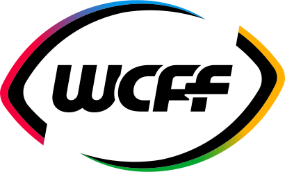
Primary
The primary one is for apps, social media and any place where space is tight.
-
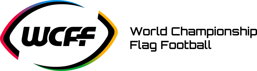

Secondary
The secondary one adds the full name, World Championship Flag Football, for official documents and partnerships.
-

Additional
The additional version uses solid colors for cases where a gradient can’t be reproduced.
Colors
Black and white come first, so the logo holds up in reverse. The rest of the palette is built around an Olympic-inspired combination of yellow, red, blue and green, which adds the energy. Blue stands for the sky over every field, red for passion, green for the grassroots spirit of the sport, and yellow for the golden moments of achievement.
I made all four more vibrant than usual, and in the primary logo they blend into a smooth gradient, following the look of the games industry.
HEX #000000
Primary color
HEX #FFFFFF
Primary color
HEX #0096EA
Secondary color
HEX #F4003A
Secondary color
HEX #00A532
Secondary color
HEX #FFB000
Secondary color
Typefaces
Orbitron · headlines
Orbitron, with its clear gaming feel, carries headlines and section titles.
World Championship Flag Football
Onest · body text
Onest handles body text, buttons and navigation, because it stays easy to read on any screen.
Flag football will make its Olympic debut at the 2028 Summer Olympics in Los Angeles.
Into production
When the game moved into production, the developers needed a simpler logo to meet Apple’s design requirements. The client chose one of the solid-color versions, which was already part of the system, so the switch was easy.
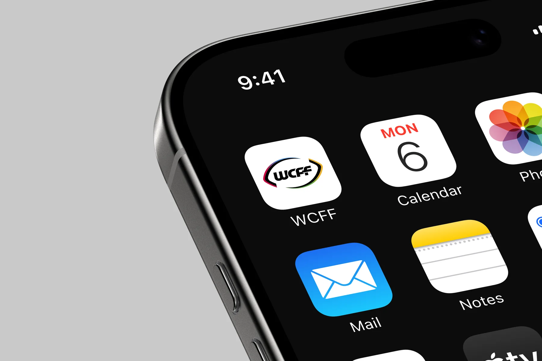
The Result
WCFF is now live as a mobile game, with a logo that stays recognizable in black, white and full color.
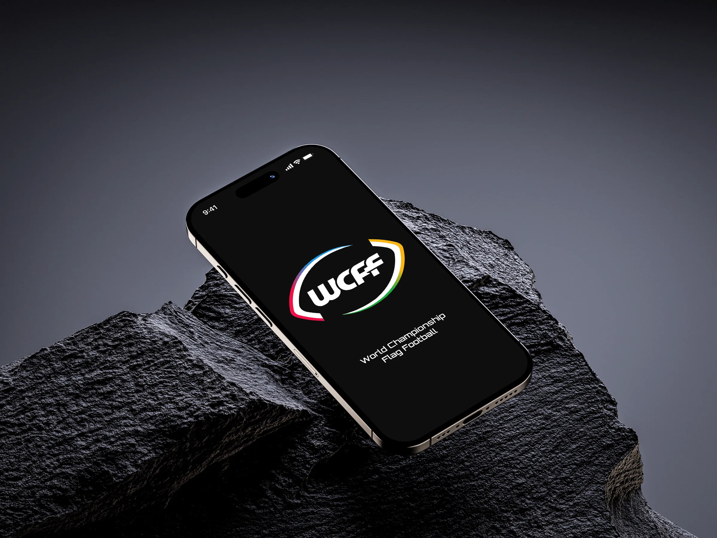
WCFF is not affiliated with or endorsed by the International Olympic Committee.
Back All case studies