Case study · Visual identity
The Digital Her: From Virtual Assistant to a Brand That Helps Women Build Aligned Businesses
![Vanessa holding her phone in front of a dark corrugated wall, the “the digital [hér]” wordmark in ivory beside her](/assets/images/work/the-digital-her/hero.webp)
The Challenge
Vanessa spent years working as a virtual assistant. She knew online businesses from the inside: what it takes to launch them, run them, and keep them going. Now she was ready to build something of her own, a digital brand that helps women create online businesses aligned with their lives.
The brand had to be feminine-focused, but it also had to feel digital, since that’s where her audience lives and works. The logo needed to hold both.
The Logo
I combined three ideas in the logo.
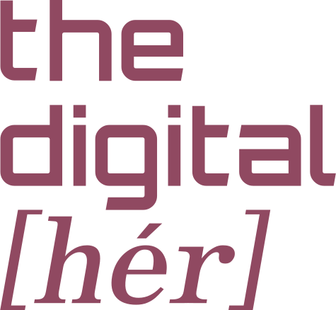
“Digital” is set in a geometric, square typeface. It reinforces the digital foundation of the brand.
“Her” is set in a soft, classical serif italic. It brings in the feminine essence and balances the sharper shapes next to it.
The square brackets and the accent mark around “her” put the focus where it belongs: on the women this brand is made for.
Together they make a wordmark that is modern, feminine, and clearly about her.
Logo structure

Logo variations
There are three logo variations, each suited to a different space and placement.
-
Primary (stacked)
Full logo. Used wherever there is enough space (visual space) without compromising readability.
-

Horizontal
A single-line lockup for wide, shallow spaces.
-

Icon
The variation for very small placements like a favicon or social media icon.
Colors
The palette comes from the beauty shelf: women’s cosmetics like powder, blush, and lipstick. Soft ivory and beige tones keep things light, dusty rose and blush add warmth, and a deep rosewood, like a classic lipstick shade, keeps the brand grounded and easy to read.
HEX #904961
Rosewood · Primary color
HEX #FCF5EF
Ivory · Primary color
HEX #E3D3CA
Beige · Secondary color
HEX #D7BDB3
Blush · Secondary color
HEX #C18B8F
Dusty rose · Secondary color
Typefaces
LINE Seed Sans Bold · headlines
Clean and geometric, it reinforces the digital foundation of the brand.
Build a business aligned with your life.
LINE Seed Sans Regular · body text
The same family, at Regular weight, carries body copy. Modern and easy to read on screen.
I help women build online businesses aligned with their lives.
Cormorant Infant SemiBold · quotes & highlights
A soft, classical serif italic, the same face the “[hér]” in the wordmark is set in. It adds a touch of personality wherever it appears.
Aligned. Confident. Digital.