Case study · Brand identity
Finding a way through the maze of responsible gaming
A brand identity for Safer Gambling Strategies.
Project Overview
Safer Gambling Strategies (SGS) is a premier strategic advisory firm founded by Keith Whyte, an industry leader with over 30 years of experience shaping responsible gaming frameworks globally. I was tasked with translating that stature into an enduring brand identity, and I delivered a brand system built for executive-level engagement across commercial operators, regulatory bodies, professional sports leagues, and public institutions.
The Challenge
The commercial gaming landscape often defaults to neon, high-energy palettes or defensive regulatory tropes. SGS needed to occupy a different space, one of authoritative navigation, so I had to balance unyielding institutional integrity with pragmatic, strategic counsel.
The Concept: Navigating the Maze
I drew the logomark from the idea of clarity within complexity. Gambling addiction and policy landscapes are a convoluted labyrinth, and SGS is the steady, structured guide that leads stakeholders through it.


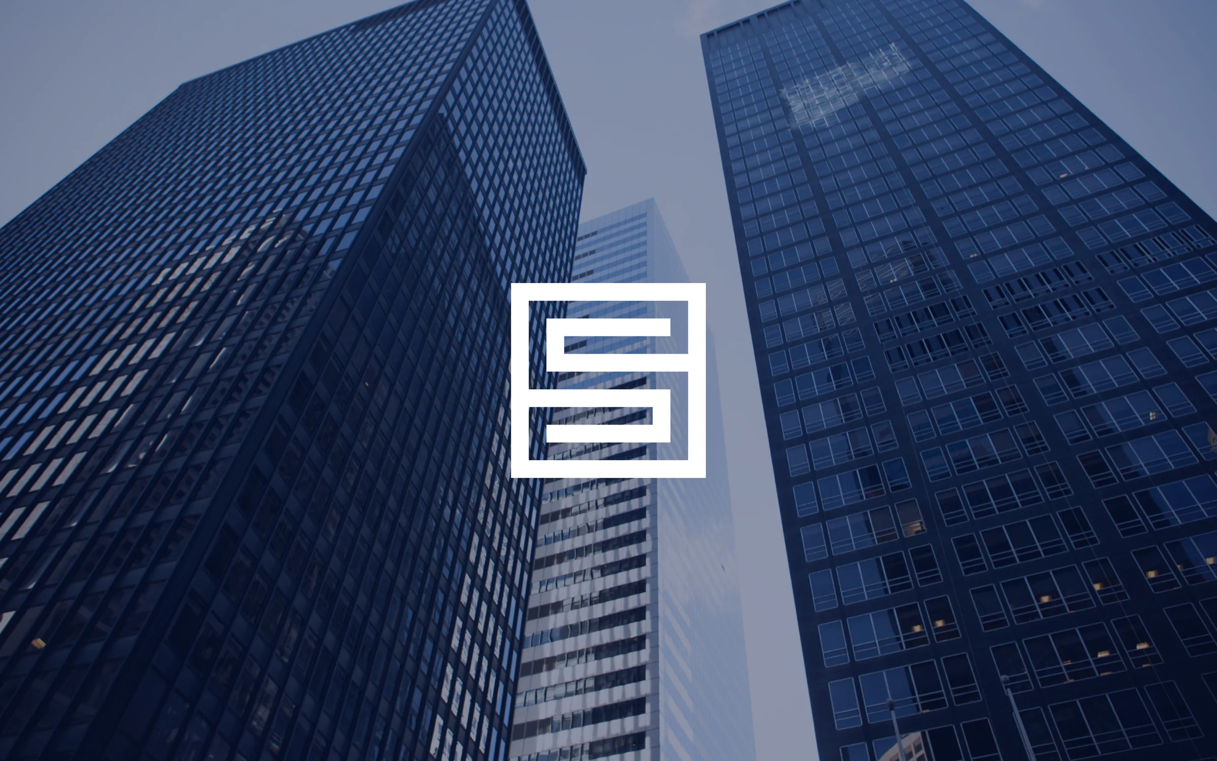
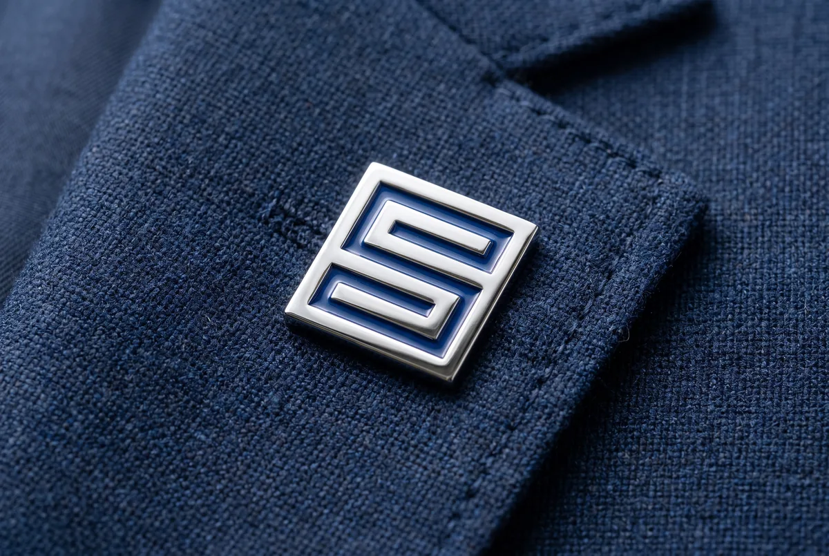
Logomark Geometry: I constructed the emblem on an exact 11 x 11 grid, embedding the letterform “S” into an architectural labyrinth. That geometric precision conveys stability, structural logic, and strategic pathway generation.
Logo hierarchy
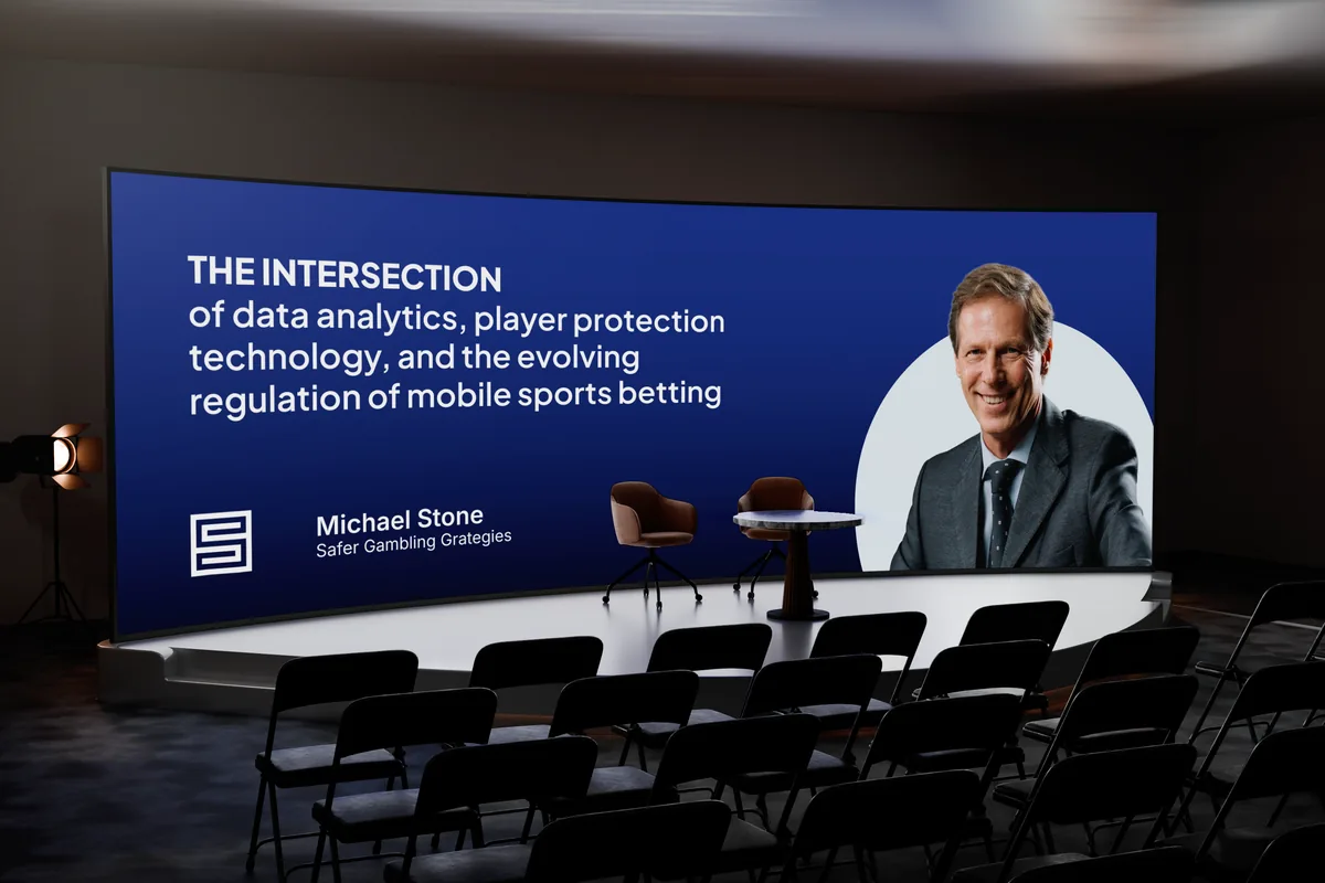
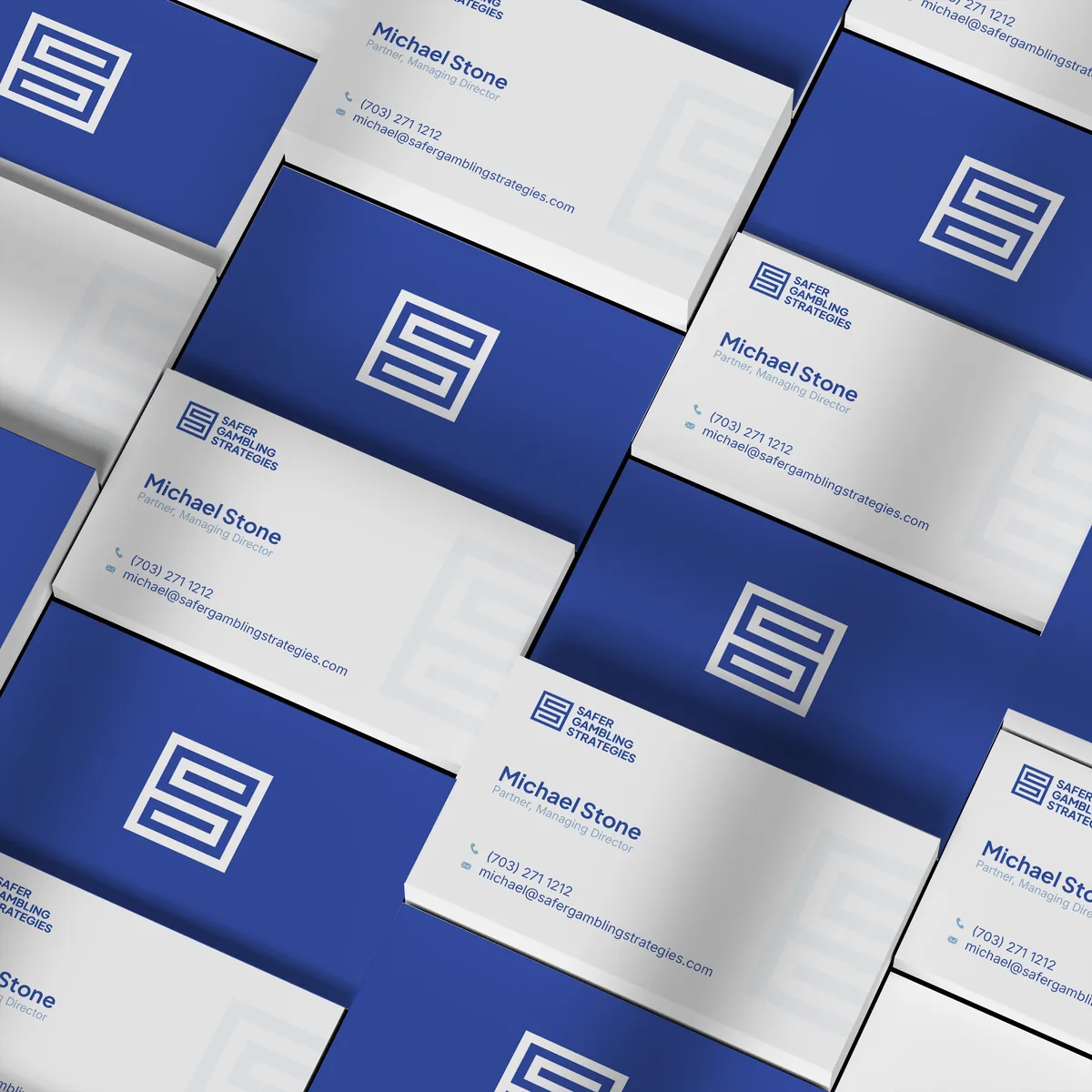
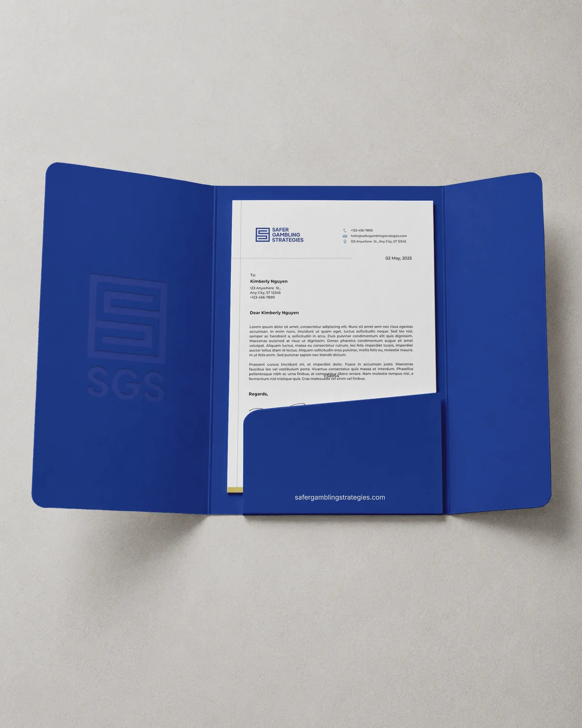
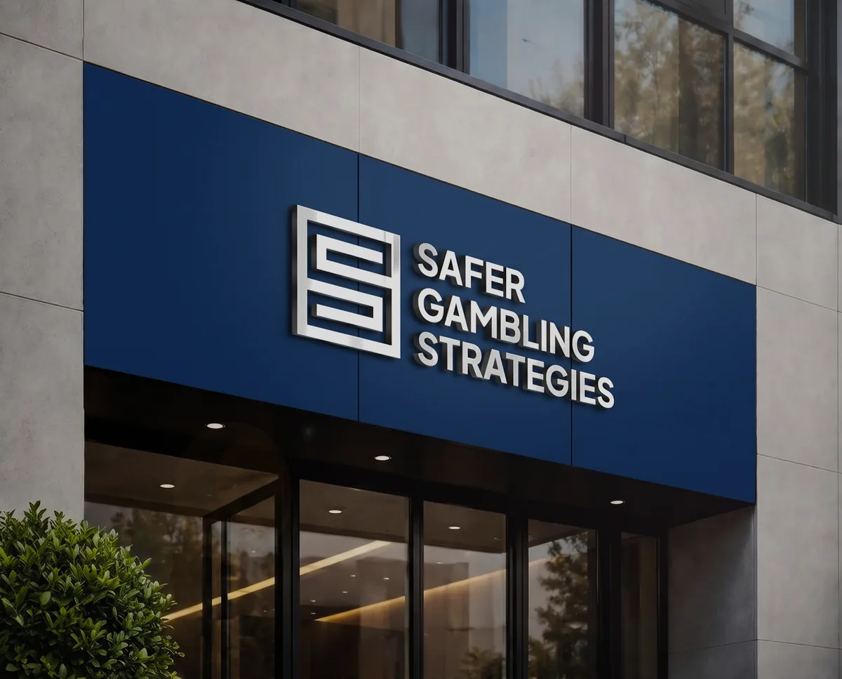
The mark works in three responsive configurations: Full Wordmark, Short Abbreviation (SGS), and Standalone Emblem. That keeps it legible from 15px digital icons up to large-scale keynote signage.
-

01Full Wordmark
-

02Short Abbreviation
-

03Standalone Emblem
Color hierarchy
PrimaryPrimary colors form the foundation of the visual identity, establishing executive gravitas and clear contrast.
Marian Blue
HEX #263987
CMYK 100:92:10:5
Seasalt
HEX #FAFAFD
CMYK 1:1:0:0
SecondarySecondary colors are used for complementary structural elements.
Alice Blue
HEX #E2EDF3
CMYK 10:2:2:0
Blue Grey
HEX #699AC5
CMYK 60:30:8:0
AccentThe accent color is reserved for small details, such as CTA buttons on the website.
Old Gold
HEX #C7A941 · CMYK 25:30:90:0
Typography
Plus Jakarta Sans · headlines
I chose clean, confident geometric headers (SemiBold to ExtraBold) that signal forward movement and decisive counsel.
Strategic solutions for safer gambling
Inter · body text
A highly legible neutral grotesque, optimized for complex white papers, policy decks, and screen presentations.
Our evidence-based approach helps organizations implement effective responsible-gaming measures while maintaining operational efficiency.
I just finished a full brand design and website build project with Nadiia and I couldn't be happier! Not just great results but a smooth process from start to finish. Indeed, she generated so many great design concepts the hardest part was choosing one. I will continue to use Nadiia for all my design needs and would strongly recommend her for yours as well.