Case study · Brand identity, Packaging
Pairwise: From First Product to a Brand System Built to Grow
The Challenge
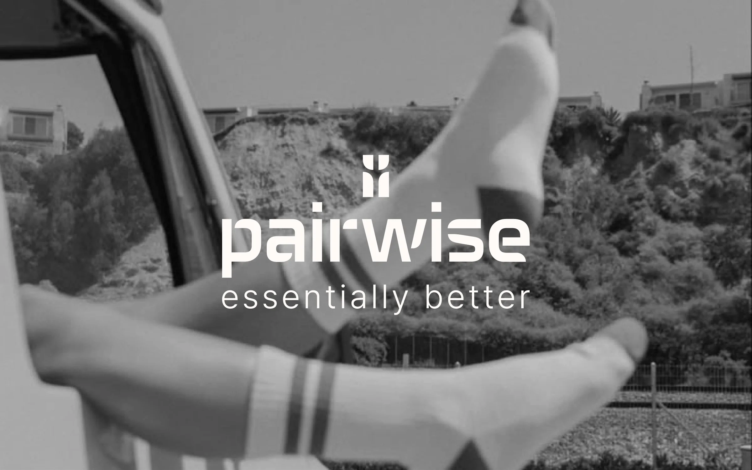
Pairwise came to me before launch with a name, a product (premium everyday socks), and a clear taste: clean, understated, modern. They wanted simplicity, visual balance, and a design system that works on packaging and on the web.
There was one more detail. Down the road, Pairwise might grow beyond socks into other clothing, underwear for example. That created a tricky balance. A brand too tied to socks would need a redesign the moment the range grows. A brand too generic would feel empty on day one.
The Research
I started with the brands the client admires, then looked wider at apparel and underwear in the mid to high price range.
Most of them share the same look: cold and minimalistic. I didn’t see that as a problem, it’s actually a strength. Minimal identities stay current for a long time. So instead of fighting the category style, I focused on making the simplicity feel intentional, with a system behind it.
The Insight
A brand that starts with one product stays flexible only if its visual identity is a system and the logo does not depict the actual product.
I see this often with small businesses. Most begin with a single product or service, then expand. The identity shouldn’t be the thing that holds them back.
The Strategy
Everything in the brand was built from one small set of shapes, used everywhere: in the logo, the wordmark, and the packaging structure.
Socks stay in the picture (you’ll find one hidden in the icon), but nothing locks the brand to them. If Pairwise Underwear comes next, it won’t need a new logo, just a new product.
The tagline, written for the full lockup
essentially better.
The Logo
The icon carries three meanings:
- It is mirrored vertically, which stands for a pair.
- The short and long elements meet at 90 degrees and form the shape of a sock.
- The negative space between all four elements reads as a tree trunk with branches, a quiet nod to the natural ingredient behind the product: cotton.
I built the custom wordmark from the same elements, so the icon and the wordmark work together and separately in the same way. The full logo holds up in one color (all black or all white) as well as in two.
-

One color
-
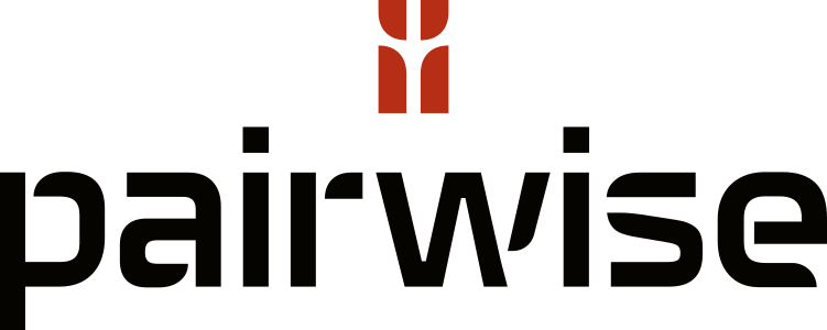
Two color
Logo versions
For different uses, the logo comes in four versions, from the full logo to the icon alone, so the brand stays clear from a website header to a tiny label. I also wrote the slogan for the full version: “essentially better.” It’s short and understated, like the brand itself.
-
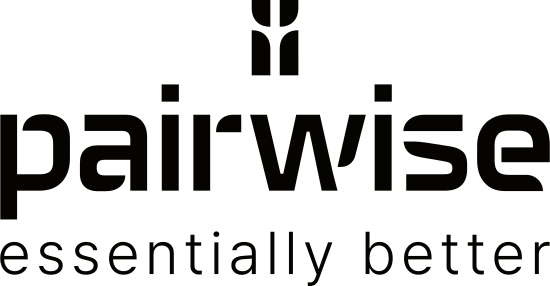
Full logo
Icon, wordmark and slogan together. For the website header and hero placements.
-
Icon + wordmark
The everyday lockup, without the slogan. For packaging and most product touchpoints.
-
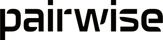
Wordmark
For wide, shallow spaces where the icon would feel cramped.
-

Icon
For a favicon, an app icon, or any space too small for the wordmark.
Colors
The palette is warm and calm: charcoal black and ivory as the primary colors, beige and tan as secondary, and one terracotta accent that adds energy without getting loud.
Charcoal — Primary color
HEX #060400 · CMYK 70:65:70:90
Ivory — Primary color
HEX #FFFBF7 · CMYK 0:1:2:0
Beige — Secondary color
HEX #F7E4D3 · CMYK 2:10:15:0
Tan — Secondary color
HEX #CFAE80 · CMYK 20:30:55:0
Terracotta — Accent color
HEX #B72F26 · CMYK 20:95:100:10
Typefaces
Space Grotesk Bold · headlines
Geometric with a slightly sharp edge, but not too sharp.
Essentially better.
Pretendard Light · body text
Handles body copy, clean and easy to read at length.
Premium everyday socks, made with 90% combed cotton.
Pretendard SemiBold · secondary headlines & navigation
The same family, a weight up, for secondary headlines and navigation.
Premium Cotton Socks
Packaging
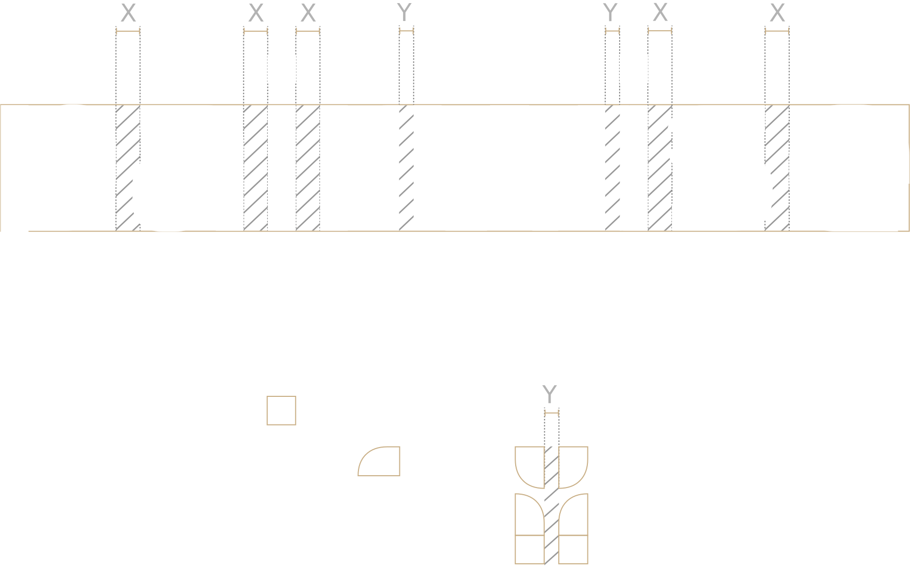
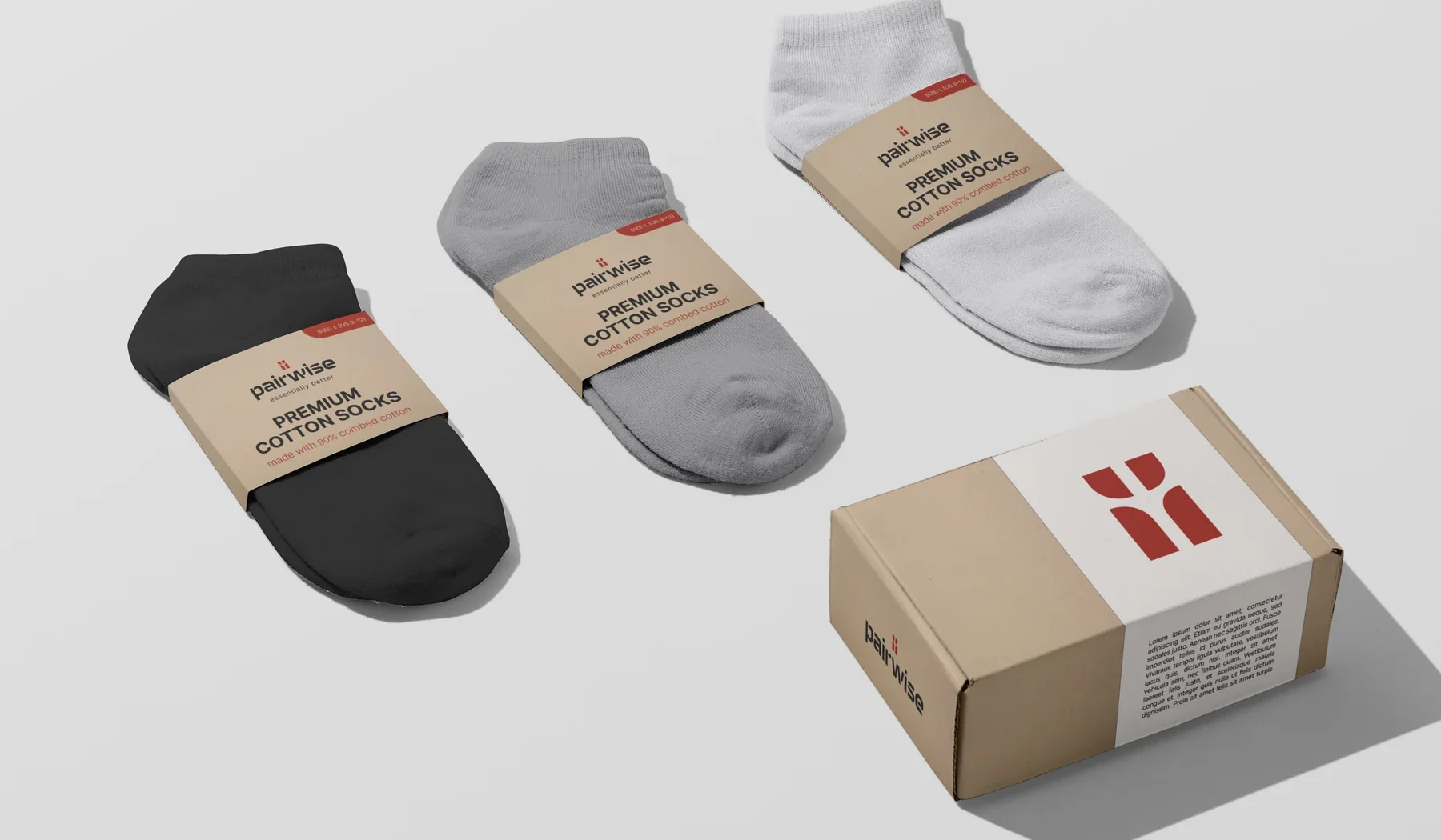
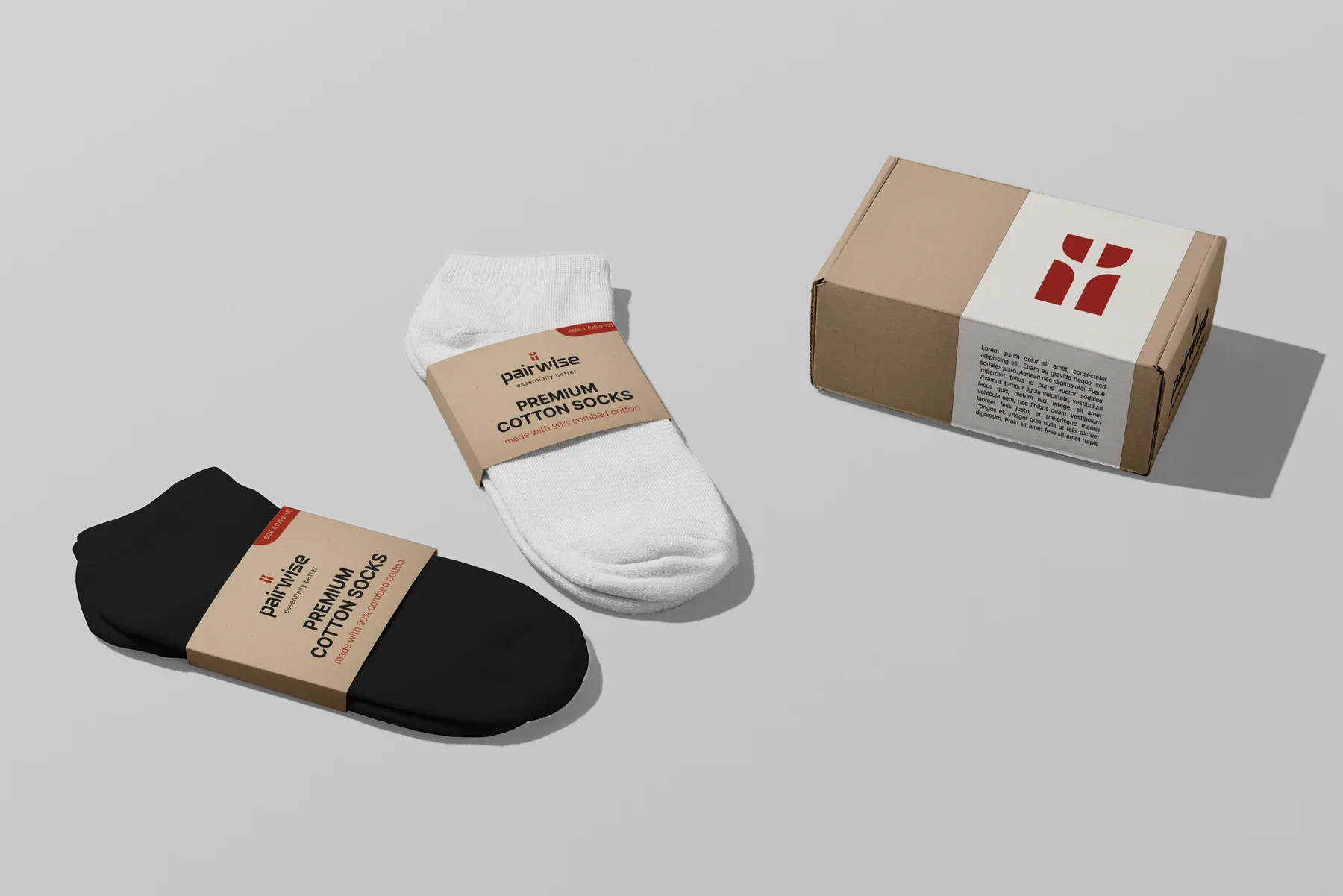
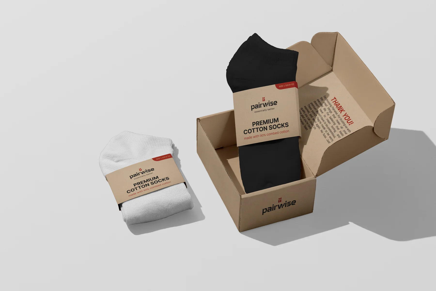
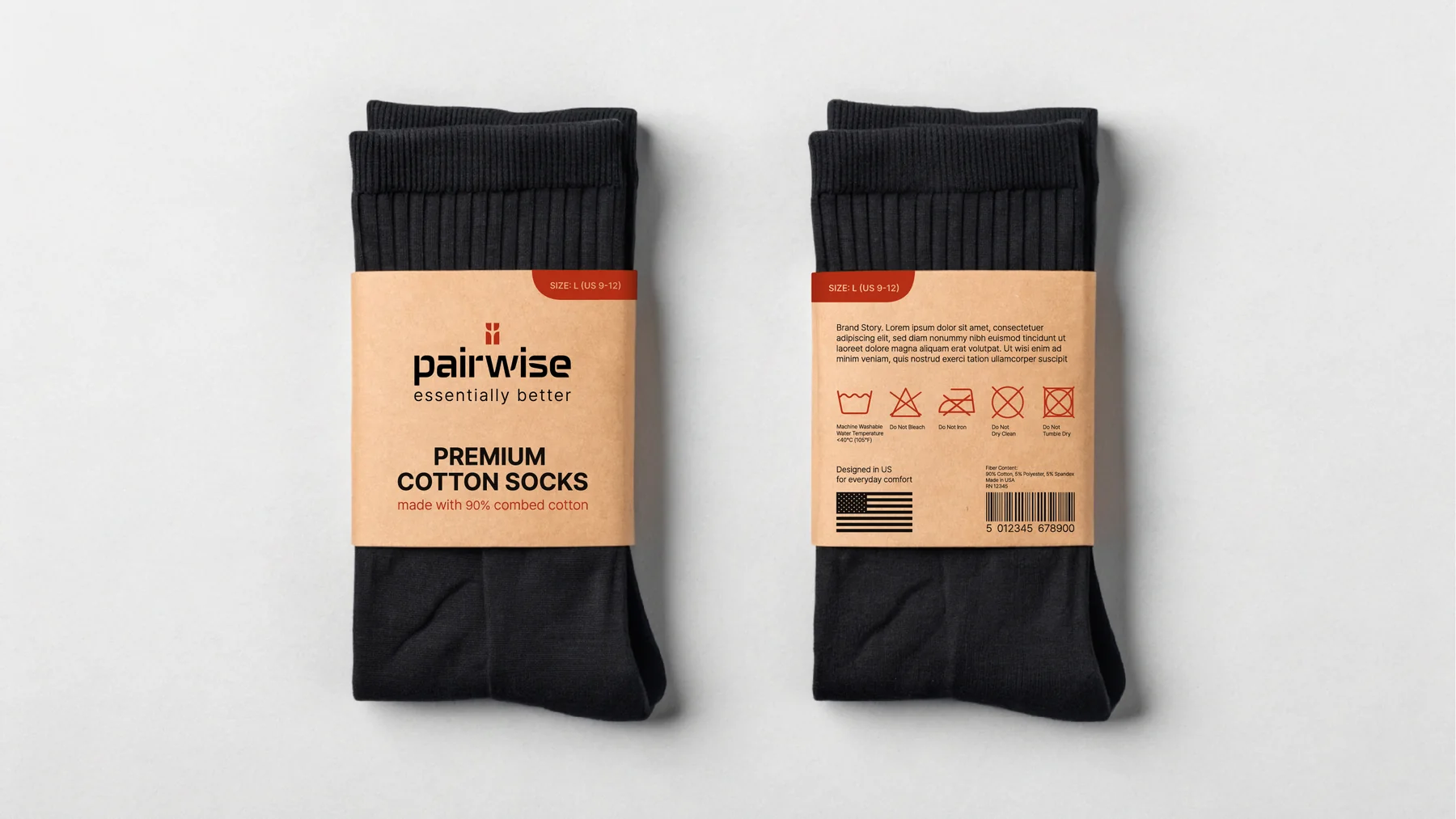
The kraft sleeve uses the same long element from the logo in its dieline, so the packaging shares a structure with the logo. It’s simple to produce, and it can easily be adapted for new products.
The Result
Pairwise received a complete visual identity, ready to use across packaging and web, and flexible enough to grow beyond its first product. As of this writing, the brand and product are still in final preparations for launch.
Absolutely outstanding work! Nadiia delivered a flawless brand identity package that perfectly captured our vision. Every element from the logo to typography and color choices was thoughtfully crafted and professionally executed. Communication was smooth, revisions were handled with care and creativity. Highly recommended!