Case study · Visual identity
Nest Therapy for Kids: Building Trust Without Blending In


The Challenge
Nest Therapy for Kids provides ABA therapy for autistic children and teens, ages 0 to 20, in Oklahoma. The founder came to me for a brand identity that would feel safe and warm for families, and still look professional to schools and community partners.
His audience was clear: moms between 20 and 40 in the Oklahoma City metro. Choosing a therapy provider for your child is not a small decision. It’s personal, and it’s built on trust.
He also had one strong wish. There was a lot of blue in his industry, and he wanted to stand out. Either avoid blue completely, or create a logo strong enough that the color wouldn’t matter.
The Research
So before sketching anything, I wanted to see what “a lot of blue” actually looked like. I reviewed more than a dozen ABA providers in the Oklahoma City area, captured their homepages, and pulled out the main colors of each one.
He was right. Almost every palette was built on blue, from soft sky tones to deep navy. The visuals repeated too: stock photos of smiling kids with therapists, similar layouts, similar messages. Side by side, most of these brands were hard to tell apart.
The Insight
The Insight
Every provider already looks trustworthy. Very few look like a place a child would be happy to go.
Blue isn’t a bad choice for healthcare. It feels calm and reliable, and that’s exactly why everyone uses it. But trust alone wasn’t setting anyone apart. Joy, one of the client’s core values, was missing almost everywhere.
The Direction
The client described his brand in four words: competence, joy, care, and family. So the identity had to do two jobs: look credible enough for schools and partners, and feel warm enough for parents and kids.
- Competence
- Joy
- Care
- Family
That’s why I didn’t drop blue completely. Instead, I moved it deep toward violet. It still carries a sense of trust, but it no longer looks like the sky and navy blues used across the category, and it connects to the purple the client was drawn to. The warmth comes from yellow and orange.
The tagline
The client’s tagline, “Supporting today. Soaring tomorrow,” guided the rest.

The nest is about safety and support.
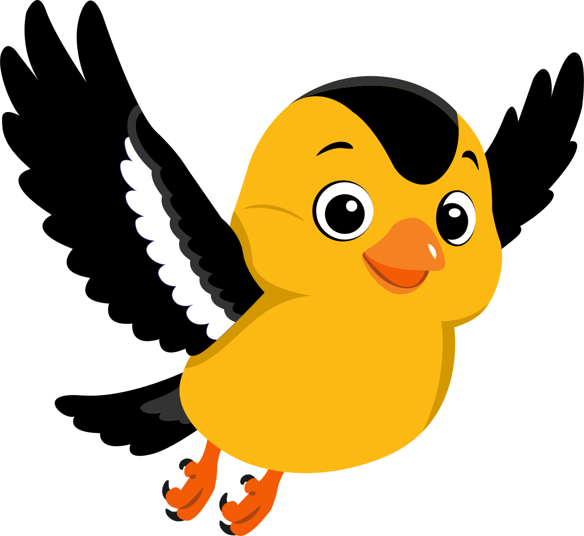
The bird is about growing up and flying on your own.
The Identity
Logo
The client came with a clear structure in mind: “Nest” as the large, bold centerpiece, “Therapy for Kids” in a clean, minimal font underneath, and an abstract nest icon on the left. Nothing too literal or cartoonish.
For the icon, I arranged soft, leaf-like shapes in a circle. Together they form a nest, a place that holds and protects. The swirl adds movement, a quiet hint of growth and taking off. The wordmark is a bold serif that feels confident and established, while the descriptor stays light and simple.
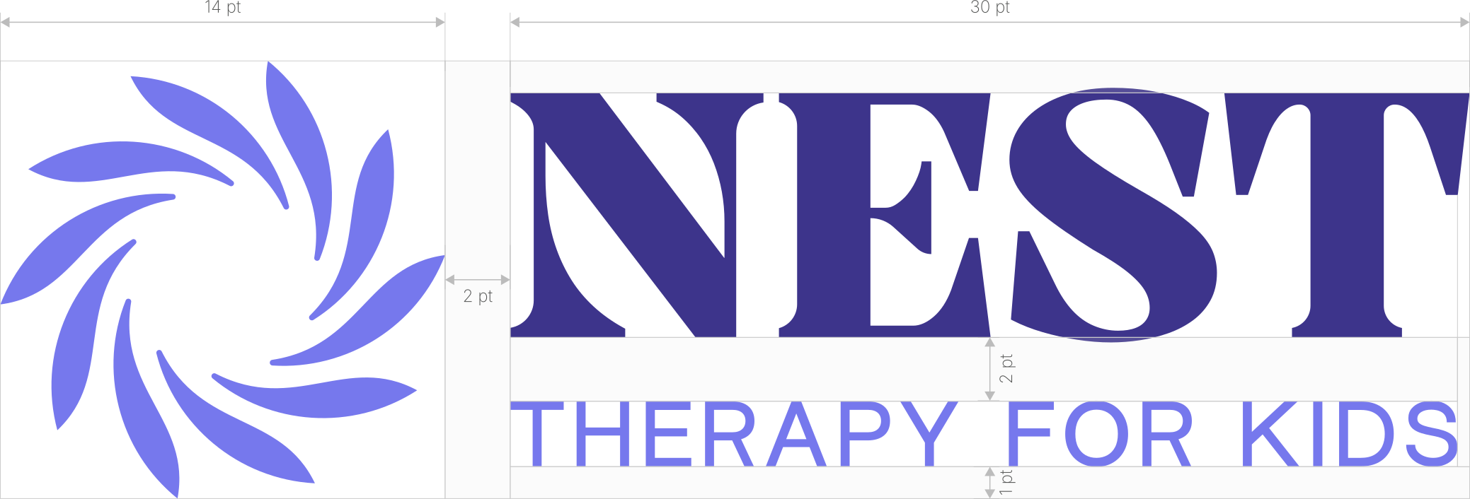
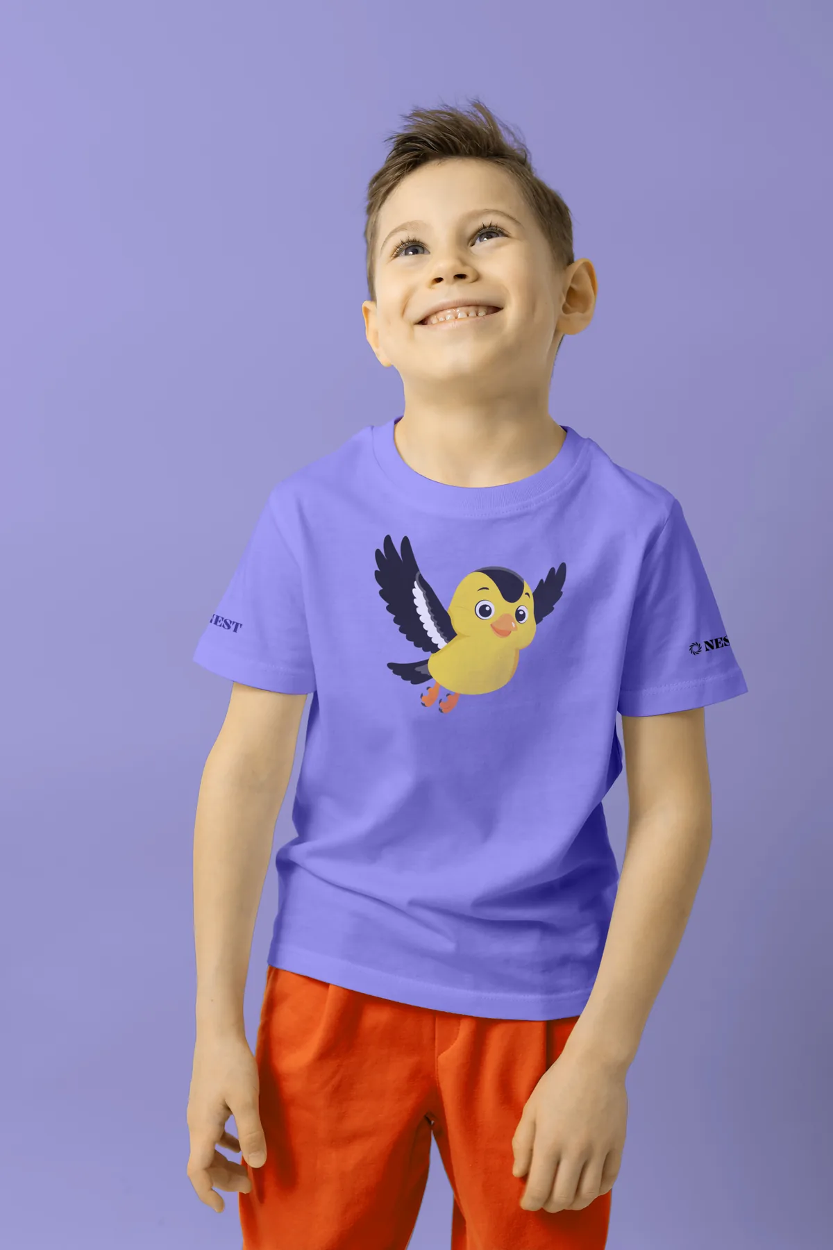
I also built a full logo system: the primary logo, two secondary versions for narrow or small spaces, and a logomark for favicons, social avatars, and patterns. It works on shirts and web headers, and scales up for event banners.
-
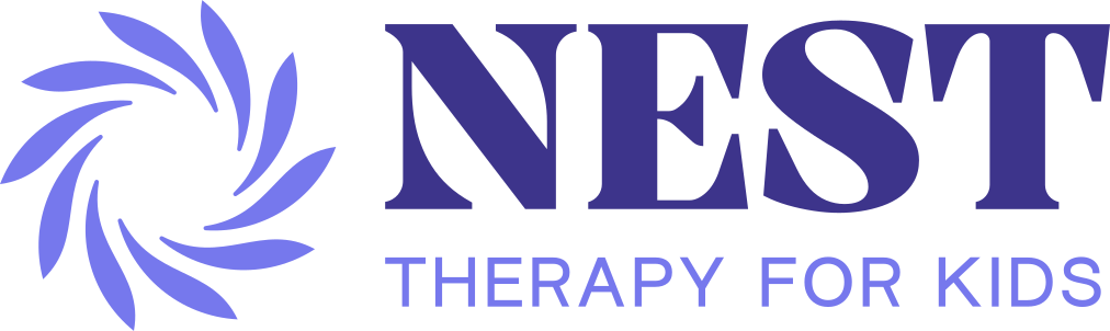
Primary logo
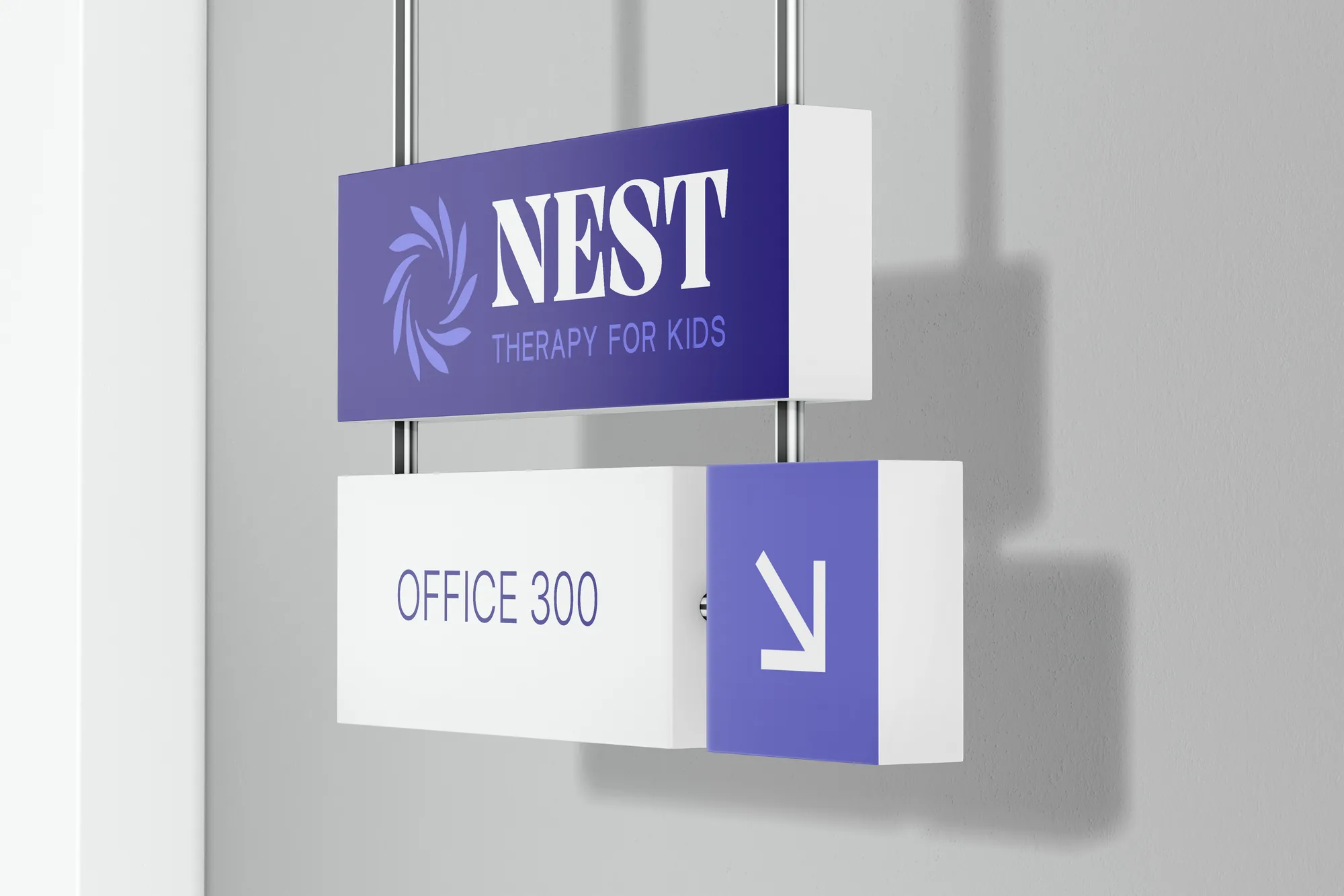
Website headers, signage, banners
-
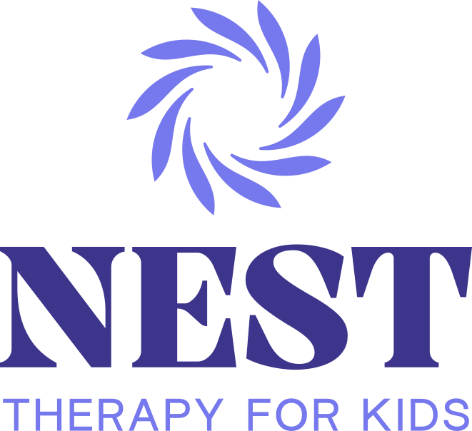
Secondary v1
When the primary doesn’t fit the space
-

Secondary v2
When the descriptor would be too small to read
-
Logomark
Favicons, social avatars, patterns
Colors
Rich Blue is the main brand color. Periwinkle softens it. Lemon, Orange, and Carrot bring the energy and joy, and Ivory and Platinum keep layouts light and clean.
Rich Blue Primary
HEX #3A358C
CMYK 95/95/7/2
Periwinkle
HEX #7678ED
CMYK 60/55/0/0
Lemon
HEX #FDB913
CMYK 0/30/100/0
Orange
HEX #F58220
CMYK 0/60/100/0
Carrot
HEX #F35B04
CMYK 0/80/100/0
Ivory
HEX #FBF9F0
CMYK 1/1/5/0
Platinum
HEX #EFEFEF
CMYK 0/0/0/6
Typefaces
Playfair Display, a high-contrast serif with warm character, carries the headlines. Inter, clean and easy to read at any size, handles body copy and subtitles.
Headlines
Playfair Display
SemiBold, Bold, ExtraBold
Supporting today. Soaring tomorrow.
Body and subtitles
Inter
Light, SemiBold
Nest Therapy for Kids
ABA therapy for autistic children and teens, ages 0 to 20, in Oklahoma.
Mascot
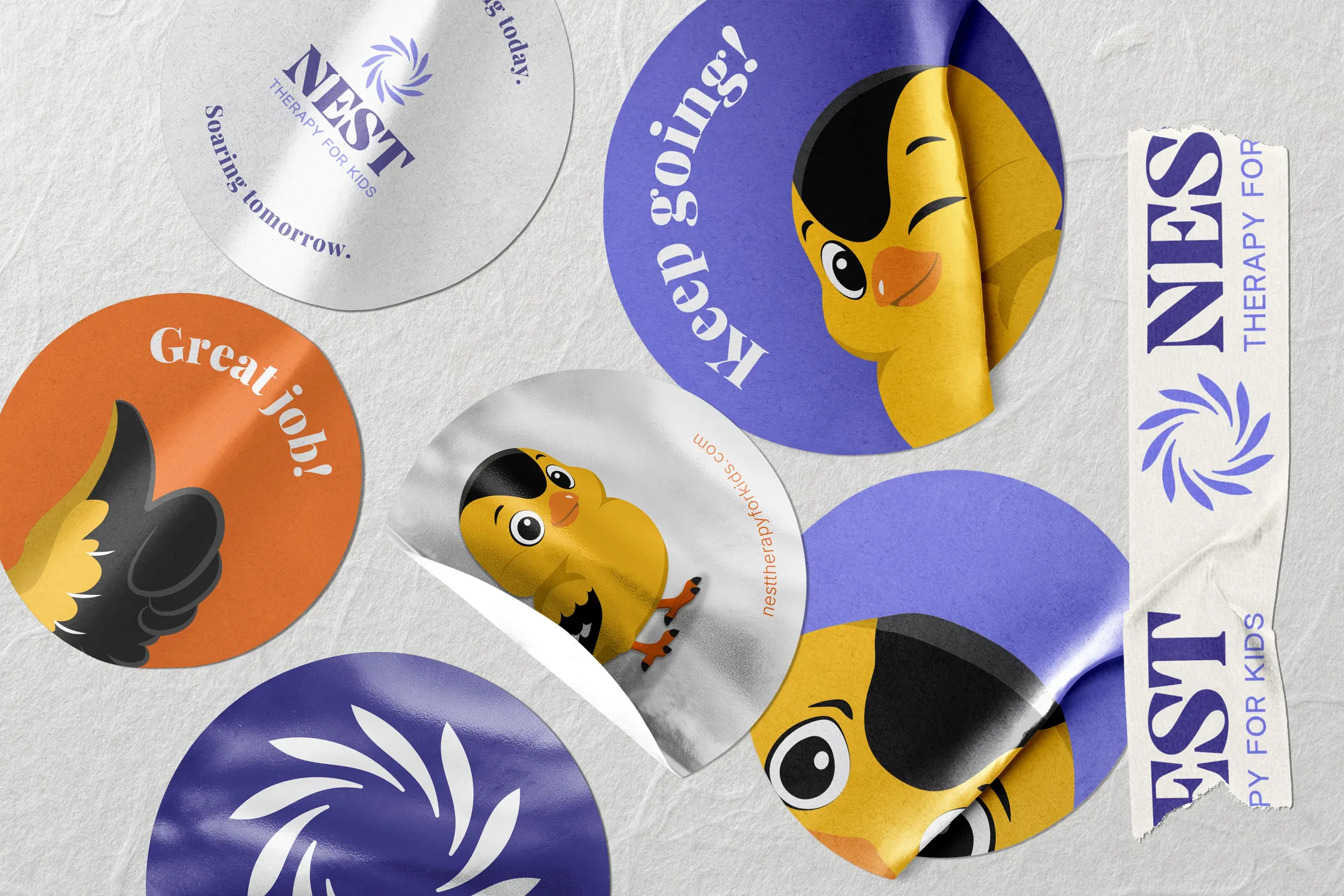
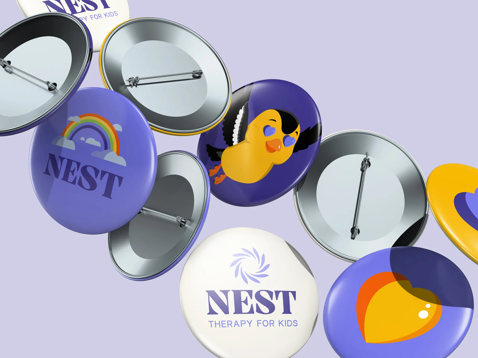
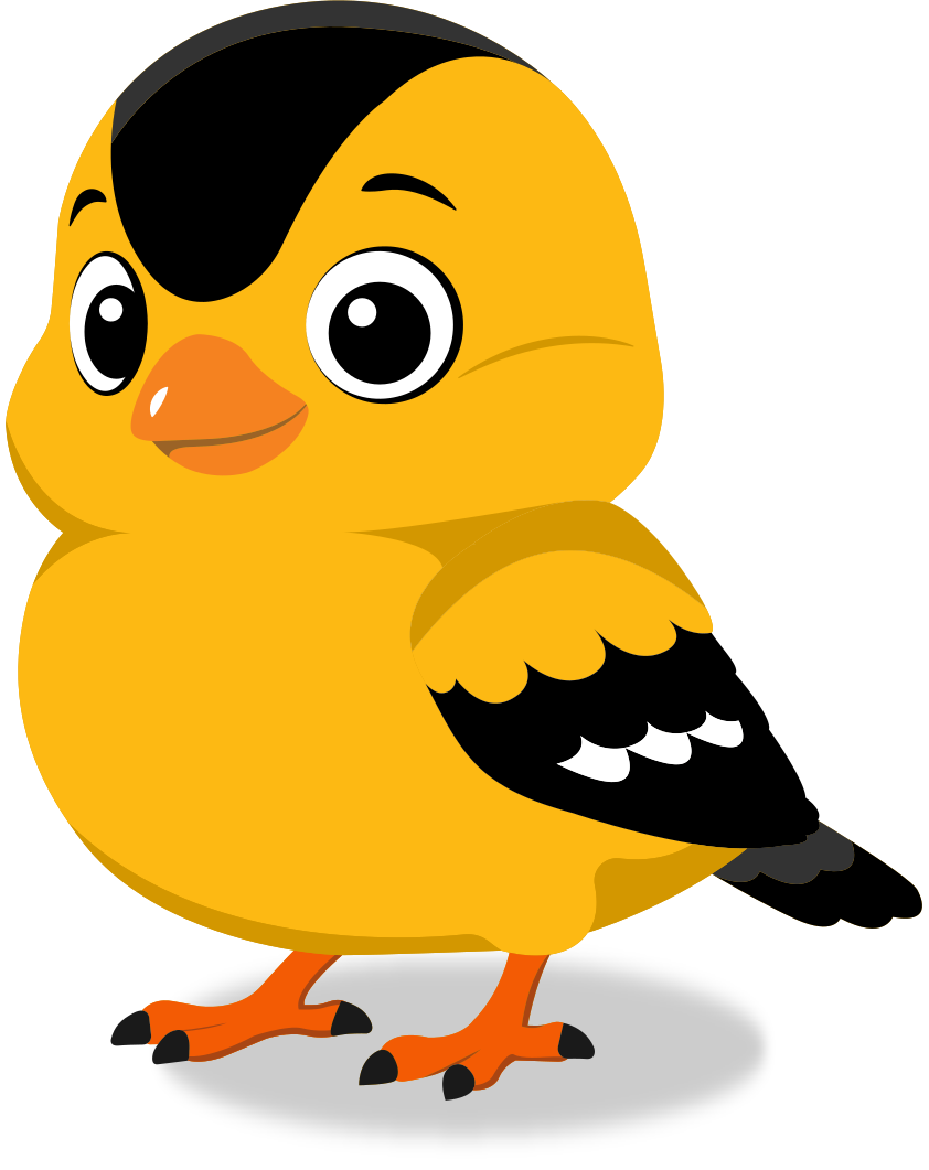
The client wanted a friendly character to make the brand more approachable for kids, and he had a specific bird in mind: the American goldfinch, a small, bright yellow bird common in Oklahoma. I drew it round, soft, and expressive, cute but not silly. Its yellow body matches Lemon from the palette, so the mascot feels like part of the brand.
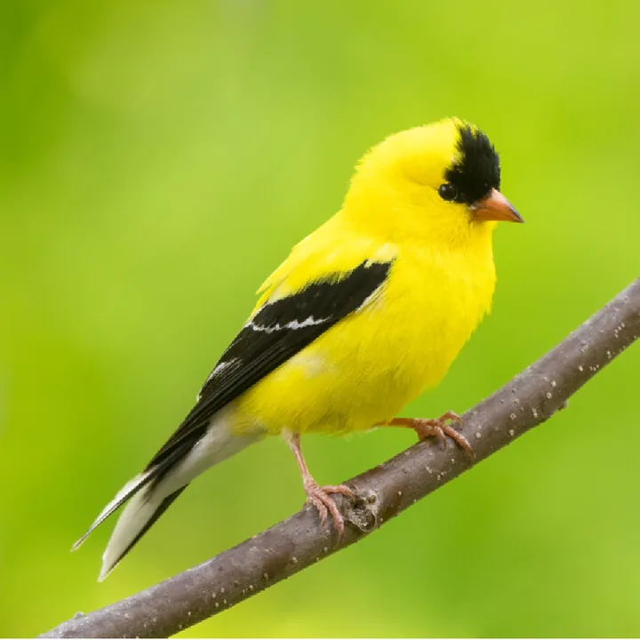
The referenceAmerican goldfinch
Body colorLemon #FDB913
The Result
I delivered a complete brand guidelines package: logo system, color palette, typography, mascot rules, clear space, minimum sizes, and logo don’ts. Everything the team needs to apply the brand consistently, from signage and shirts to web headers and clinic materials.