Case study · Brand strategy, Brand identity
Lux Flowers: From At-Home Florist to a Brand Built on Guaranteed Smiles
The Challenge
Lux Flowers started in 2024 as an at-home flower business: pickup and delivery only, run by one owner. It was already working. But the owner wanted more: a real brand, and eventually a physical location to match.
Like a lot of founders at that stage, her first instinct was to build something for everyone. It made sense on paper: cast a wide net, don’t limit the market.
But trying to speak to everyone usually means no one feels like the brand was made for them. So before writing a single word of strategy, I looked at who was actually buying.
The Research
Before interviews, I pulled a year of the client’s own sales data. The pattern was clear: 60% of buyers were white men, mostly 25 to 45, based in Green Bay and Bellevue. That matched the area itself, where about 66% of residents are white, and it became the primary audience.
- 60%
- of buyers were white men, matching an area that’s about 66% white
- 25–45
- the age range most of them fell into
- 3 of 5
- main flower shops in the area were Latina-owned
It also reframed the competitive picture. The area’s second-largest community is Hispanic and Latino, about 17% of residents, and three of the five main flower shops were Latina-owned and already serving that community well. Tastes and traditions around flowers differ from one community to another, so competing head-on there would have meant fighting for ground Lux Flowers wasn’t positioned to win. The smarter move was to own a specific audience, narrower but deeper.
From there, I ran in-depth interviews with men in that target group to understand how they actually think about buying flowers.
The Insight
The early hypotheses about why men buy flowers turned out to be wrong. What came through clearly, again and again, was this:
Men don’t buy flowers. They buy guaranteed happiness.
Birthday, sickness, an achievement, no occasion at all: the reason didn’t matter. What mattered was seeing her smile. Most of them admitted they don’t personally value flowers, or even understand them. What they value is the certainty that the gift will land.
That led to a second insight that changed the marketing strategy as much as the brand one: the real competition wasn’t other florists. It was anything else that could deliver the same guaranteed happiness, like food delivery, a nice dinner, or a box of sweets.
The Strategy
Those two insights shaped everything that followed.
Brand promise
We deliver smiles, not just flowers.
I positioned Lux Flowers not as a luxury purchase, but as relationship insurance. The marketing direction shifted to match: show the reaction, not the bouquet, and sell the outcome, not the arrangement.
One decision came directly out of this research. The owner had considered renaming the business, worried “Lux Flowers” sounded generic. But client feedback told a different story: some people mentioned they were choosing her specifically because of the name. Paired with the insight that men are willing to pay more for a guaranteed outcome, the name stayed. It was already doing the job a brand name is supposed to do.
The Identity
The visual system needed to feel premium but never intimidating, elevated but still warm.
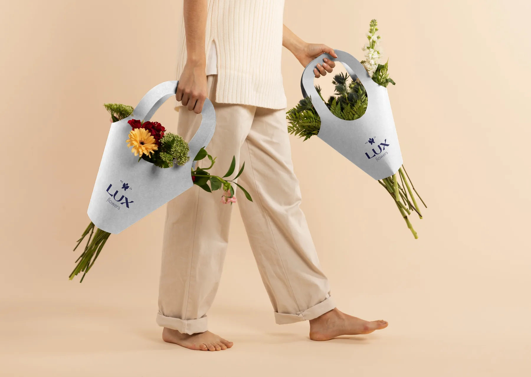
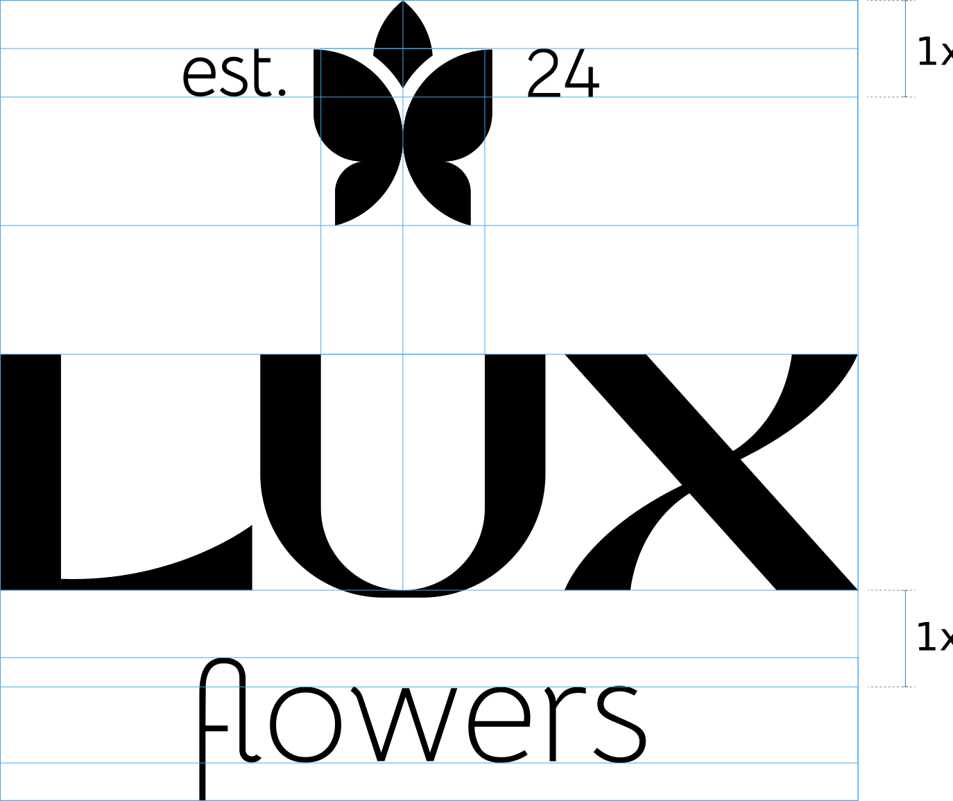
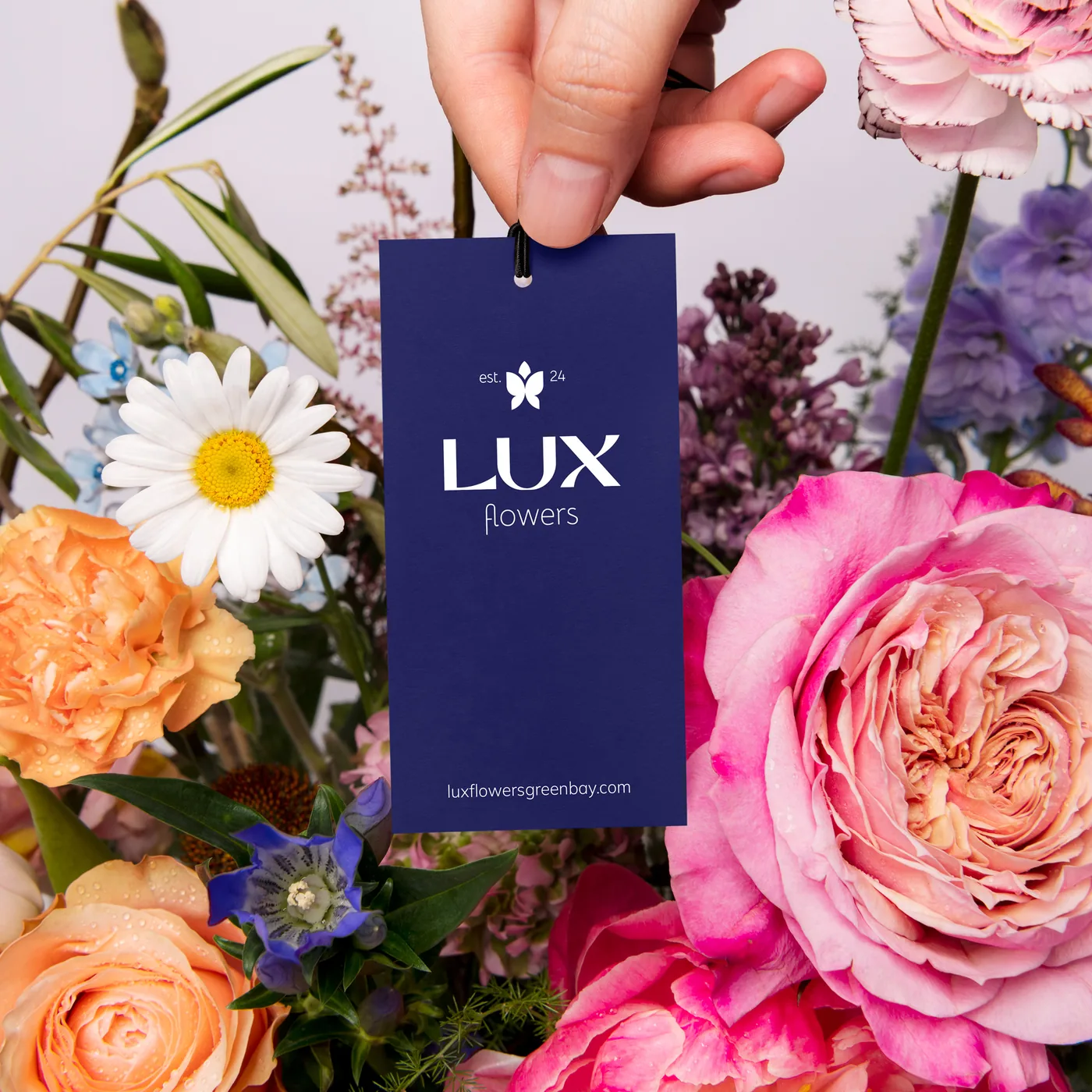
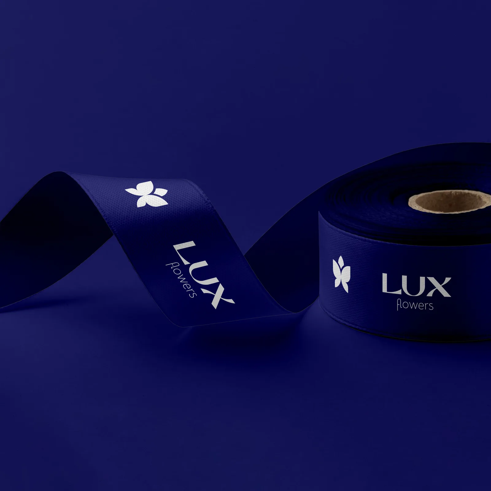
For the logo, I combined the silhouette of a flower, the core product, with a butterfly, a symbol of lightness, to reflect how simple it can be to bring on that smile. The wordmark is clean, rich, and modern, with a wave hidden inside the “X,” a quiet nod to the ribbon that ties every bouquet.
Logo structure
Logo variations


Colors
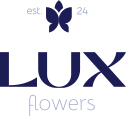
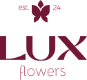
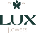
I explored a few directions, each sophisticated in its own way: a deep navy paired with soft seasalt, a warm wine paired with blush, and a rich forest green paired with cream. She gravitated toward navy and seasalt, rounded out with soft purple and pink.
-
Chosen
-
-
Final brand palette
HEX #1D1D56
Primary color
HEX #FAFAFD
Primary color
HEX #EBE1F9
Secondary color
HEX #A2A2EA
Secondary color
HEX #FFB3C6
Secondary color
HEX #FFE5EC
Secondary color
Typefaces
Marcellus · headlines
Marcellus, a refined serif, carries the headlines.
We deliver smiles, not just flowers.
Mulish · body text
Mulish, clean and easy to read, handles the body copy.
Show the reaction, not the bouquet. Sell the outcome, not the arrangement.
The Result
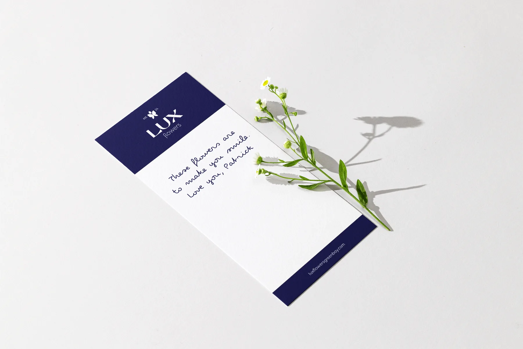
Lux Flowers launched its new brand about a year ago. The owner has since opened her first physical location, the milestone that first brought her to the idea of rebranding.
Working with Nadiia has been nothing short of amazing. She is incredibly detailed and truly helped me find my voice. From the very beginning I felt like I could fully trust her - she guided me towards the exact style I wanted to project through my business! What impressed me most is how carefully she listened — she didn’t overlook the little details, but instead made sure every question, concern, or struggle I had was heard and addressed.
She was flexible, responsive, and present. I honestly don’t think I could have done this without her. She exceeded every expectation, and I truly could not have asked anyone better.