Case study · Brand identity, Logo system
Intelligible & Summand: Rebranding a Data Company and Its Hero Product to Grow
The Challenge
Intelligible helps businesses make sense of their data. Their customers are mostly data analysis teams, and the company was ready to grow. To do that, the brand needed to look as sharp and trustworthy as the product behind it.
The client’s request
Keep the cube.
In his words, the company takes a customer’s data and organizes it into silos, and the cube stands for one of those silos. It was a good idea, so the job was not to start over. It was to make it stronger, more consistent, and easier to grow with.
Once the company brand was done, he came back with a second project: do the same for the hero product, Summand, a tool that lets teams chat with their data and get answers they can trust.
The Research
The client gave me a list of close competitors, both direct and indirect. I went through their visual identities one by one and put everything into a chart.
The pattern was easy to spot. Most of them used the same blue, purple, and pink palette. Open any of their websites and you would feel like you were in the same place.
What most of the category looks like
Intelligible
The Insight
The Insight
In a category full of blue and purple, a calm teal is what makes a data company look different and dependable.
The client’s existing teal direction was already the right instinct. It just needed to be refined and backed up with a proper system.
The Strategy
I kept the teal and made the case for it with the research chart. From there, I updated the shades and extended the palette so the brand feels confident, calm, and professional, which is how data teams want to feel when they trust a tool with their numbers.
The same palette and typefaces were built to work for both the company and the product. Summand looks like part of the Intelligible family, but still has its own identity.
Intelligible
Logo
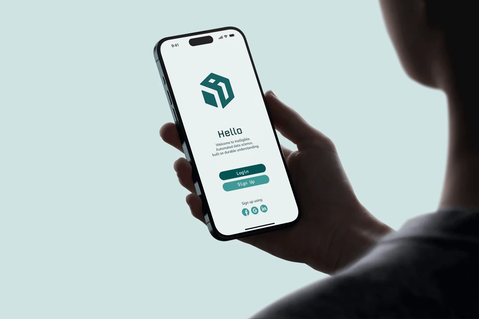
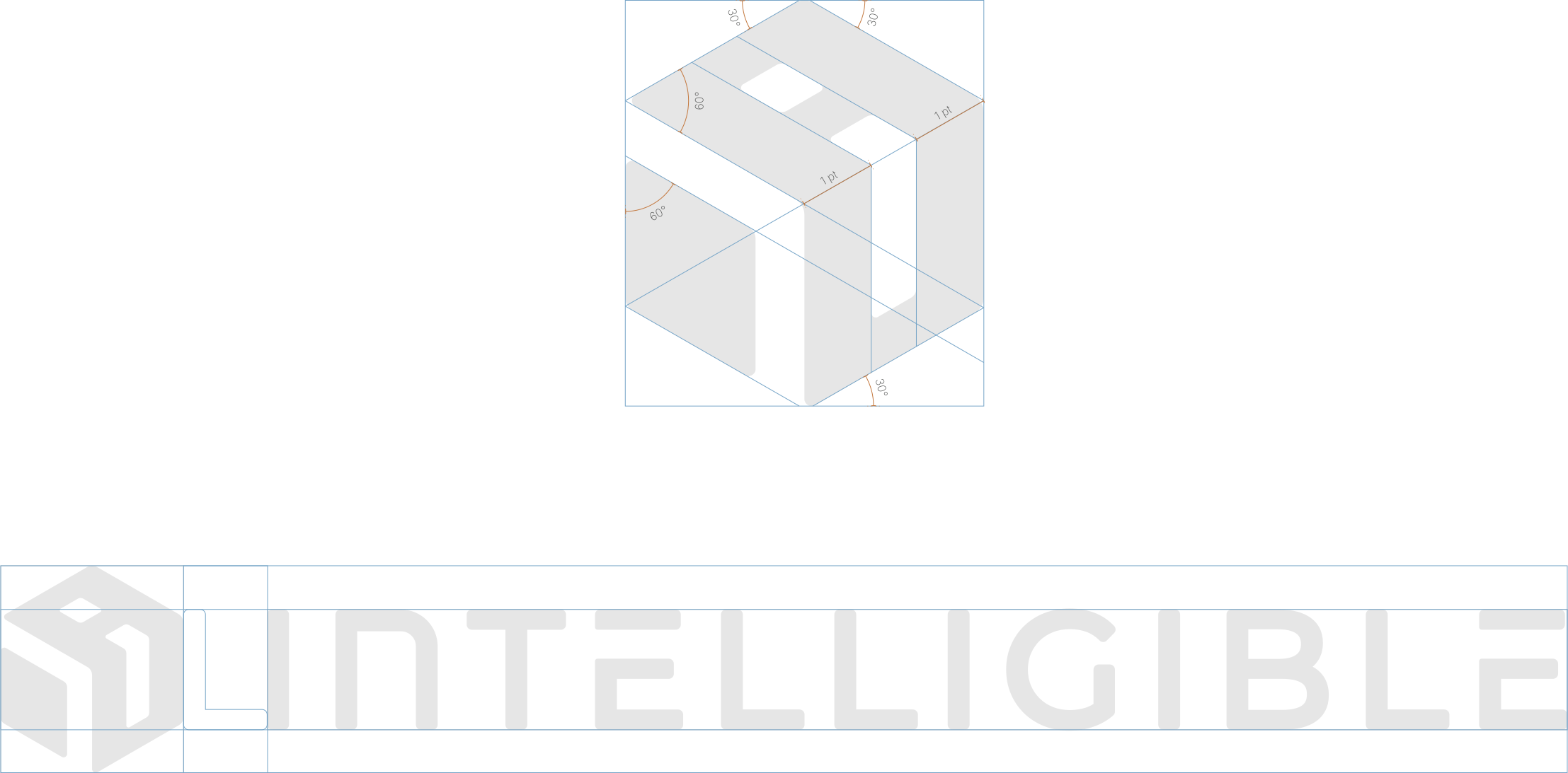
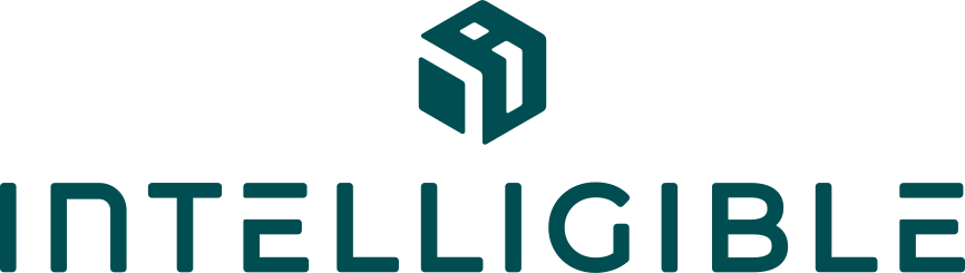
I kept the cube and gave it a cleaner, more structured shape built on consistent angles (30° and 60°), so the icon feels precise. The logo comes in four versions: primary horizontal lockup, wordmark only, vertical lockup, and icon only. Each has clear rules for spacing, minimum size, and what not to do.
-

Primary horizontal lockup
-

Wordmark only
-
Vertical lockup
-

Icon only
Summand
Logo
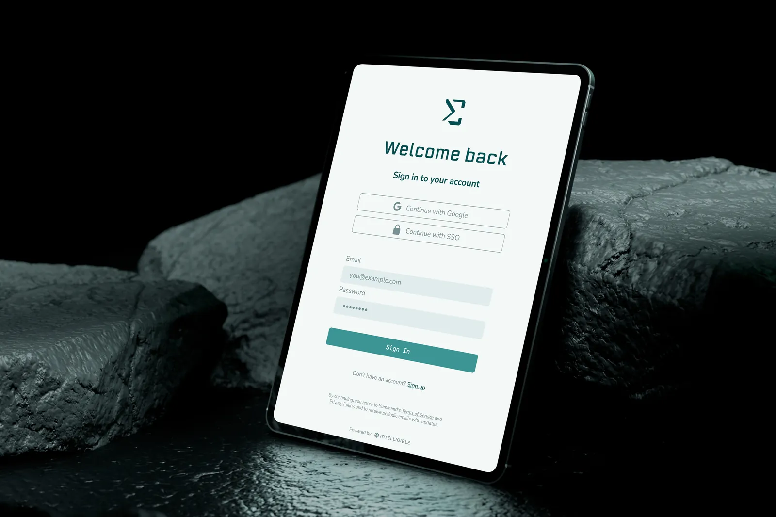
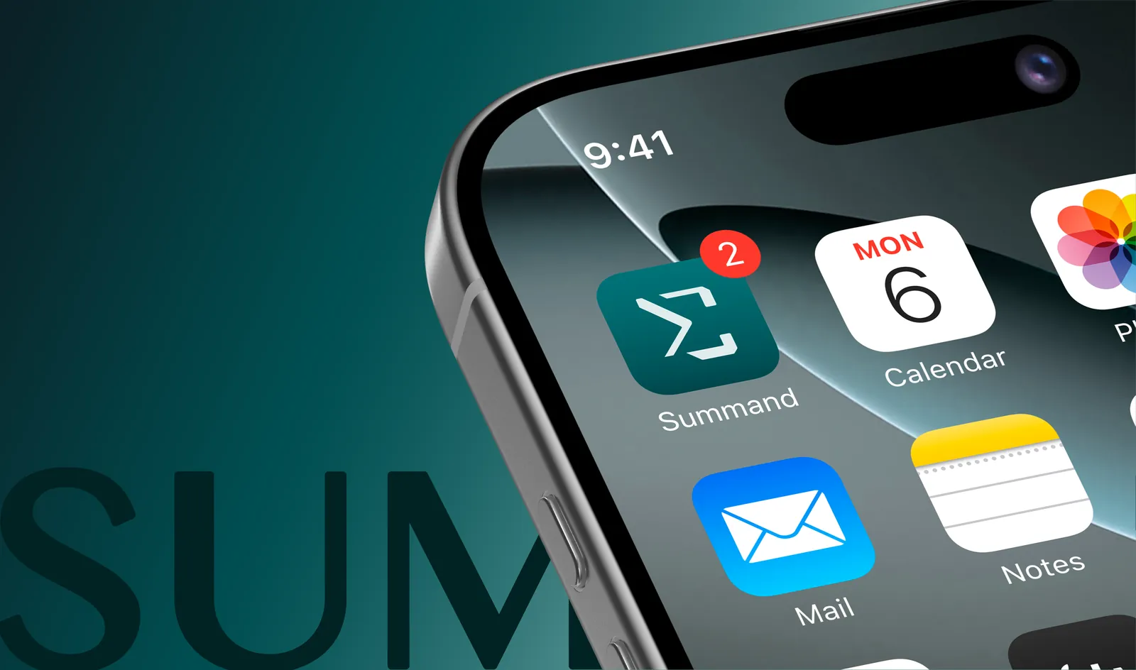
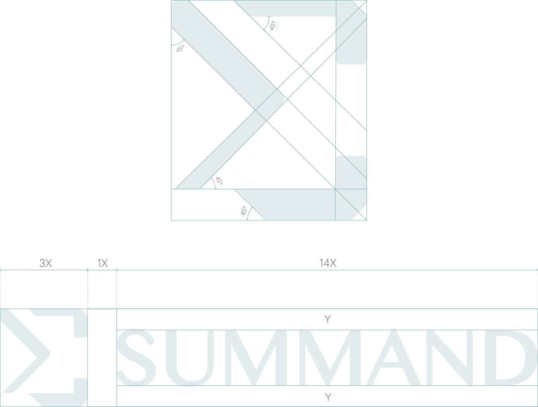
The product already had a logo with a sigma symbol, and the client wanted to keep it. I created a few options, and one clicked right away. The client liked how the second idea breaks the sigma into its parts, which is exactly what the word “summand” means and what the platform does with data.
The logo comes in three versions: primary lockup, wordmark only, and icon only. Its colors come straight from the Intelligible palette and are applied in the same way. With the palette and typefaces already set, finding the same look and feel for the product came naturally.

Summand logo structure
-

Primary lockup
-

Wordmark only
-

Icon only
Colors
Primary colors set the tone and should cover at least 70% of any design. Secondary colors are for graphic elements, content blocks, and supporting visuals. The accent is used sparingly for highlights and buttons.
Stormy Teal — Primary
HEX #004E51
Mist — Primary
HEX #E2ECED
White Smoke — Primary
HEX #F4F8F7
Jet Black — Secondary
HEX #0A2126
Cool Steel — Secondary
HEX #7C9093
Dark Cyan — Accent
HEX #559393
The brand also has a gradient, built for digital use on dark backgrounds.
Typefaces
Erbaum · headlines
Erbaum carries headlines, with its clean geometric structure giving the brand a sharp, confident edge. (Shown here in Sora, a close free stand-in, until the Adobe Fonts kit is set up.)
Intelligible
Nunito Sans Bold · subheadlines
Nunito Sans Bold carries subheadlines, warming up the geometry of the headline font just enough to stay approachable.
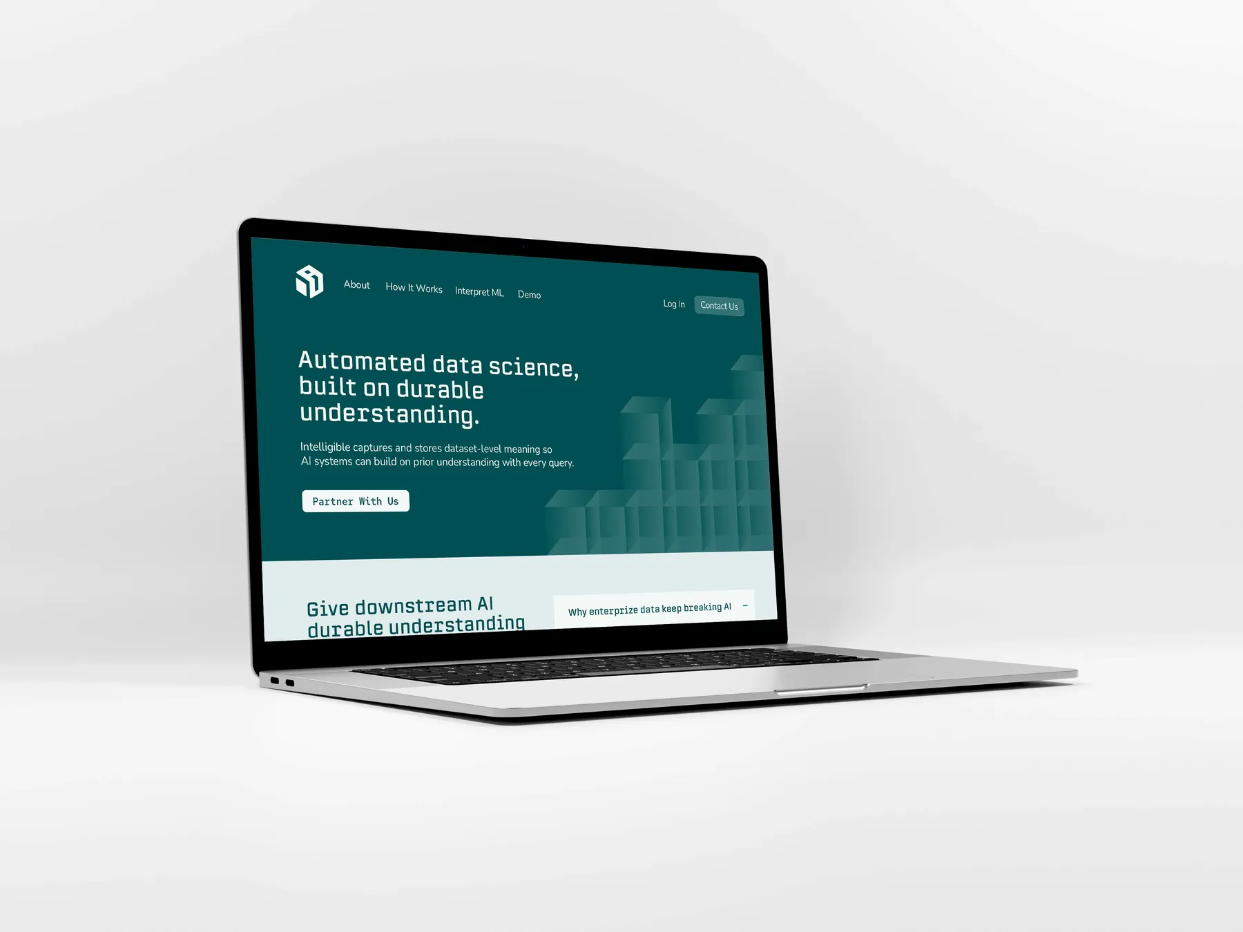
Automated data science, built on durable understanding
Nunito Sans Regular · body
Nunito Sans Regular handles body copy, staying easy to read across long-form documentation and the product UI alike.
Intelligible captures and stores dataset-level meaning so AI systems can build on prior understanding with every query.
Red Hat Mono SemiBold · accents and buttons
Red Hat Mono SemiBold marks accents and buttons, a nod to the data and code the product works with every day.
PARTNER WITH US
The Result
Both brands are live. Intelligible now has a complete brand system, and Summand has a matching one, each documented so the team can apply them consistently. The same palette, type, and cube-and-sigma thinking carry across the company website and the product, so everything feels like one family.
The Intelligible team also shared the project on LinkedIn.
See it live: intelligible.ai and summand.com