Case study · Naming, Visual identity
Ellswood: A Brand About Being Seen Well, Not Looking Younger
The Challenge
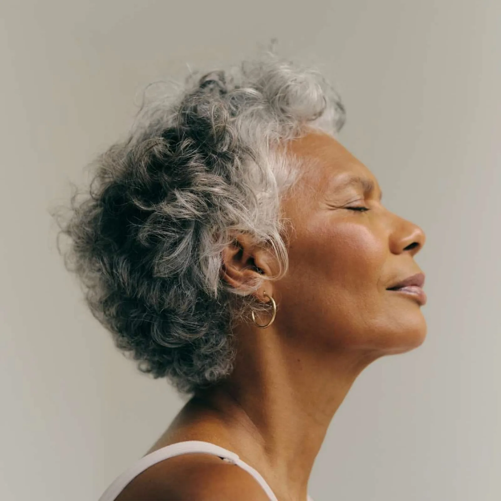
The client was building a skincare and aesthetics brand for people 55 and older. Her approach was clear from the start: not anti-aging, but pro-skin.
She also knew how she wanted people to feel: truly seen, just as they are.
She came to me for a brand identity, with a name already in mind: LuxManor. After our first call and some research, I suggested exploring other options. LuxManor was saying “luxury” out loud, and truly premium brands never use words like luxury or premium in their names.
She was open to something completely new. So the project grew, and naming came first.
The Naming
The goal was a name that doesn’t scream about luxury, but creates a quiet premium feel instead.
-
The starting point
LuxManor -
The search
I started with a long list. After more research and several rounds of options, I checked every candidate for availability, both trademark and .com domain. Then I delivered a shortlist, with a detailed explanation of how each name would support the brand’s mission and goals.
-
The result
The result was Ellswood.
- It has a connection to nature and a sense of place.
- It feels elevated without a single luxury word.
- To me, it sounded like the surname of a lord who doesn’t exist yet.
- And it starts with the same letter as the founder’s first name.
The Insight
The Insight
Most brands for mature skin promise the same thing: look younger. But that’s not what this audience actually wants.
They don’t want a different face. They want their own face, in good light.
The Strategy: Golden Hour
The brand idea became Golden Hour. It came from photographers’ slang: they call the last hour before sunset the golden hour, the most flattering light of the day. And it comes at the end.
The concept doesn’t mention aging at all. Ellswood isn’t a brand about looking younger, like most of its competitors. It’s a brand about being seen well.
The Identity
The visual system needed to feel like that light: warm, soft, and flattering.

Logo
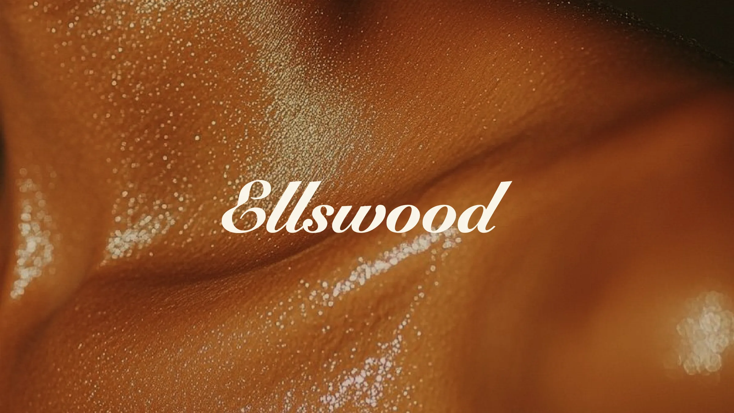
For the wordmark, I started with a script typeface and edited it to improve readability and memorability, so the text would become a logo rather than just a word. It has soft lines, the kind the sun draws when it’s low. That’s where the warmth comes from.
Colors
The main palette brings in the warm tones of golden hour: silk, sand, and bronze. Ellswood also has three lines (Aesthetics, Wellness, and Lifestyle), so I gave each one its own accent pair. They always support the main palette, never replace it.
Main palette
Silk — Primary
HEX #F8F4E8
Bronze — Primary
HEX #8A5A17
Linen
HEX #DBD3BF
Sand
HEX #EAD6B1
Dark Sand
HEX #C4AE8A
Dark Chocolate
HEX #35220B
Sub-brand accent pairs
-

Ellswood Aesthetics
Olive #958E39 Oat #EAE8D0
-

Ellswood Wellness
Yale Blue #16425B Sky Blue #D9E3E8
-

Ellswood Lifestyle
Moss #495B2F Ash Grey #DEE2DC
Typefaces
Headlines
Bricolage Grotesque
Medium, SemiBold, Bold
The finest version of you
Subheadlines
Commissioner
Medium, SemiBold
Skincare, aesthetics, and wellness built around one person at a time.
Body
Commissioner
Regular
Every protocol starts with your skin, your lifestyle, and your goals, then follows evidence rather than a menu.
The Result
Ellswood is a brand that never mentions age, yet speaks directly to the people it was built for. It’s now in a testing phase, welcoming its first clients.