Case study · Research, Brand identity
Chervona Ruta UK Foundation: From a Festival Legacy to a Brand That Feels Both Cultural and Credible
The Challenge
Chervona Ruta started in Ukraine in 1989 as a competition and festival for young musical talent. Today, the UK Foundation, a non-profit Community Interest Company based in London, carries that legacy forward. It supports Ukrainian artists and young people in the UK and beyond, and helps them stay connected to their roots.
That is a lot of history to carry. And a non-profit depends on people outside its community trusting it: funders, partners, institutions. So the brand had to do two jobs that often pull in opposite directions. It had to feel truly Ukrainian, and it had to look like an organization you can confidently back.
Job 01
Feel truly Ukrainian
Job 02
Look like an organization you can confidently back
The Research
As a Ukrainian, I didn’t need to research the cultural roots from scratch. What I needed to understand was the other side of the table: how funders see non-profits, and what makes an organization look credible at first glance.
So I looked at how potential funders perceive NGOs, then studied other non-profits in the UK: how they look, how they communicate, and what they signal before you read a single word.
The finding
One finding settled a real worry. Red was the festival’s original color, but I hesitated to build the identity around it. Then I saw that major humanitarian organizations use red as their primary color too.
Red wasn’t a risk. It was already a familiar sign of trust in this space.
The Insight
A funder needs to trust an organization before they can connect with its culture. So the brand should be the steady frame and let the art bring the color.
Concerts and performances are already full of color, costumes, and emotion. A loud brand would compete with them. A calm, confident one lets them shine.
The Direction
That insight became one clear rule:
Culture lives in the symbols
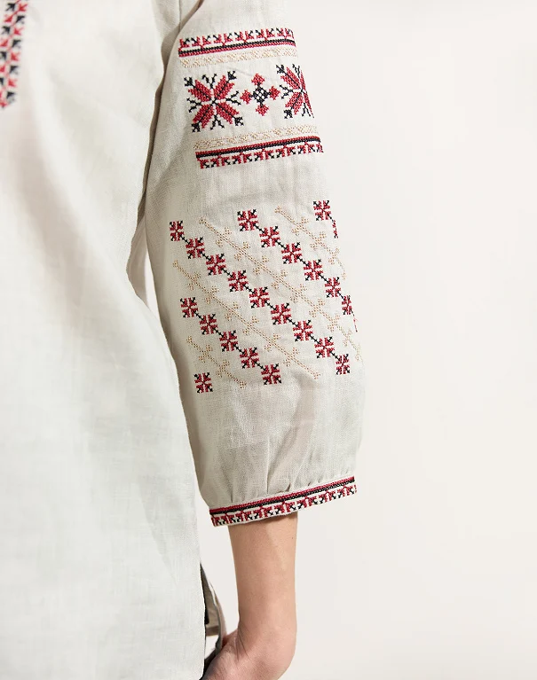
The heritage comes through the flower, the embroidery, and the colors of the vyshyvanka.
Credibility lives in the structure
The professionalism comes from how everything is built: geometric, clean, restrained, and consistent.
The Identity
Logo
The logo combines the chervona ruta flower with traditional vyshyvanka patterns, showing how heritage and modern life can meet in one mark. I built it as a geometric symbol that feels clean and professional, and not playful at all. That was a deliberate choice out of respect for what this festival has meant over the years. It works on its own, or paired with the full name in horizontal and vertical layouts.
-

The chervona ruta flower
-
Traditional vyshyvanka patterns

Logo versions
-

Icon
On its own.
-

Horizontal
With the full name, side by side.
-
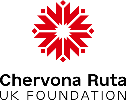
Vertical
With the full name, stacked.
Colors
The main palette is red, black, and white, the same colors historically used in vyshyvankas. I kept it to three on purpose. The Foundation’s events are colorful by themselves, and the brand shouldn’t compete with them.
Ukrainian blue and yellow appear only when official symbols like the flag or trident are used, so they always stay accurate. A small extended palette supports the main three in digital materials and infographics, but never leads.
Red — Primary color
HEX #DD0010
RGB 221:0:16
CMYK 7:100:100:0
Pantone 185 C
RAL 3020
Black — Primary color
HEX #000000
RGB 0:0:0
CMYK 60:40:40:100
Pantone 426 C
RAL 9005
White — Primary color
HEX #FFFFFF
RGB 255:255:255
CMYK 0:0:0:0
Pantone White
RAL 9016
Ukrainian blue — Official symbols only
HEX #0057B8
CMYK 100:52:0:0
Ukrainian yellow — Official symbols only
HEX #FFD700
CMYK 0:2:98:0
Extended palette
HEX #A00013
CMYK 25:100:100:20
HEX #660005
CMYK 35:100:100:40
HEX #E0CACE
CMYK 10:20:10:0
HEX #B5D2B2
CMYK 30:5:35:0
HEX #477D45
CMYK 75:30:90:15
HEX #191970
CMYK 100:100:23:17
HEX #397AB5
CMYK 80:50:5:0
HEX #BFDCF7
CMYK 25:5:0:0
HEX #EDEDEE
CMYK 0:0:0:7
HEX #D1D3D4
CMYK 0:0:0:20
HEX #C7C8CA
CMYK 0:0:0:25
HEX #939598
CMYK 0:0:0:50
HEX #636466
CMYK 0:0:0:75
HEX #FFF8DC
CMYK 0:0:15:0
HEX #F1D5AB
CMYK 5:15:35:0
HEX #AF8F69
CMYK 30:40:65:5
Typography
e-Ukraine Head · headlines
Headlines use e-Ukraine Head, which draws on early 20th century Ukrainian graphic culture and the Ukrainian baroque. It feels distinctly Ukrainian but stays modern and readable.
Chervona Ruta
e-Ukraine · body text
Body text uses e-Ukraine, a clean sans-serif that works well in both Ukrainian and English, which matters for a bilingual audience.
Connecting Ukrainian Heritage with Global Communities
Graphic element and grid
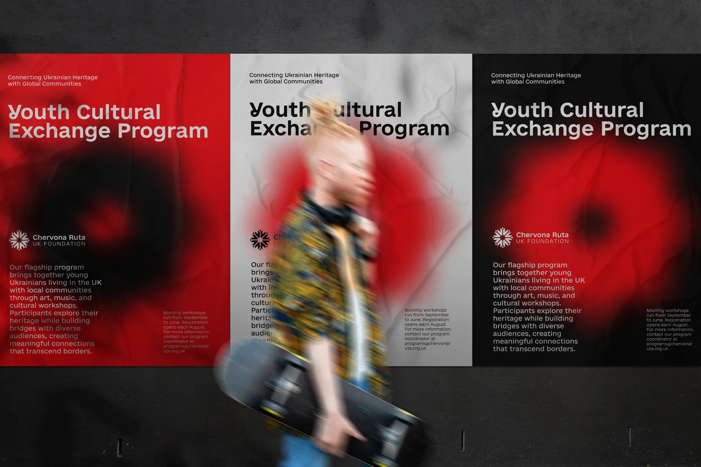
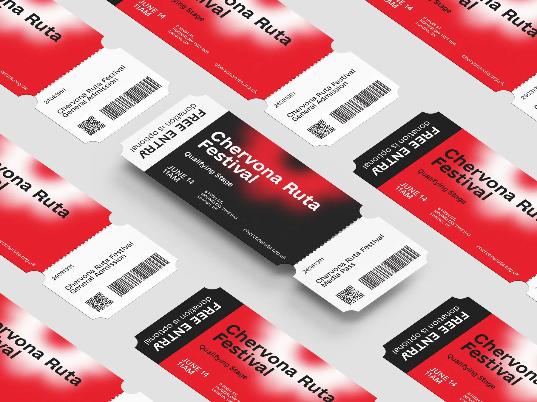
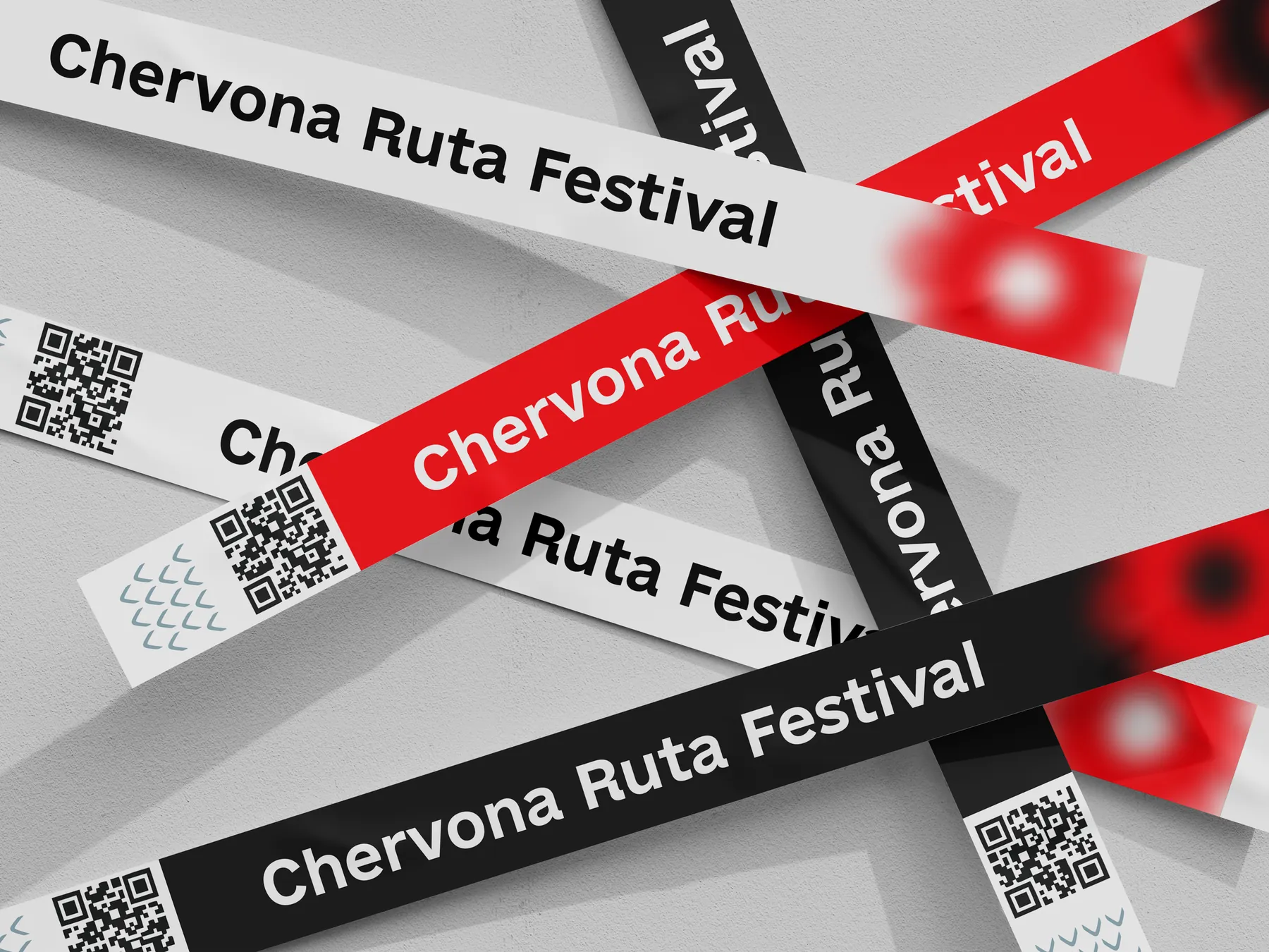
I also created a blurred ruta flower, a soft graphic element for posters, presentations, and social media. It adds depth and recognition without taking attention from the content. It comes in white, red, and black for different backgrounds.
A simple grid keeps posters and stories consistent, with protected free zones for breathing room and photos running full-bleed.
The Result
The client approved the identity with zero revisions and was excited to present it to the festival’s organizing committee. The organization has already successfully held a number of competitions and is preparing for new initiatives with American partners to bring music and culture to a wider audience.
Nadia! That’s so awesome! I’m sure I’m not giving away any secrets when I say you’re a top-notch professional! I’ll be proud to present this to the festival organizing committee.
The e-Ukraine typeface is © the Ministry of Digital Transformation of Ukraine, licensed under CC BY 4.0. The font files here were converted from OTF to WOFF2, with the outlines unchanged.
Back All case studies